

 Português
Related Posts
[/et_pb_text][/et_pb_column][et_pb_column type=”3_5″ _builder_version=”3.25″ custom_padding=”|||” custom_padding__hover=”|||”][et_pb_post_title meta=”off” featured_image=”off” _builder_version=”3.19.18″ title_font=”|700||||on|||” title_font_size=”36px” border_width_bottom=”5″ border_color_bottom=”#0c71c3″][/et_pb_post_title][et_pb_text admin_label=”Info” _builder_version=”4.9.10″ text_font=”||on||||||” text_font_size=”12px” text_letter_spacing=”1px” text_line_height=”1.5em” custom_margin=”-40px|0px||” custom_margin_tablet=”-20px|||” custom_margin_phone=”” custom_margin_last_edited=”on|phone” custom_padding=”0px|0px||” z_index_tablet=”500″ custom_margin__hover_enabled=”on”]
The strategy map is a resource that acts as a catalyst and helps to align objectives.
[/et_pb_text][et_pb_text admin_label=”Lista de tópicos” _builder_version=”4.9.10″ max_width=”80%” module_alignment=”center” custom_margin=”-20px||0px|” custom_margin_tablet=”0px||” custom_margin_phone=”” custom_margin_last_edited=”on|phone” custom_padding=”20px||0px|25px” border_radii=”on|15px|15px|15px|15px” border_width_all=”1px” border_color_all=”#d6d6d6″ box_shadow_style=”preset1″]In this article we will see:
[/et_pb_text][et_pb_text admin_label=”Tópico 1″ module_id=”topic_01″ _builder_version=”4.9.10″ text_font=”||||||||” text_letter_spacing=”1px” header_font=”|||||on|||” header_text_color=”#474747″ header_3_font=”|||||on|||” custom_margin=”30px|0px|10px|0px||true” custom_padding=”10px|||10px||false” border_color_all=”#0c71c3″ border_width_bottom=”3px” border_width_left=”3px”]Creating a Strategy Map
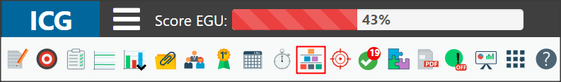
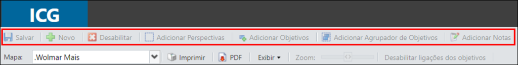
[/et_pb_text][et_pb_video src=”https://youtu.be/Y_YGvjTSGZk” _builder_version=”4.6.0″ _module_preset=”default”][/et_pb_video][et_pb_text _builder_version=”4.9.10″ custom_margin=”|25px|0px|25px||true” custom_padding=”||0px”]To create or consult a Strategy Map, click on the icon indicated below.
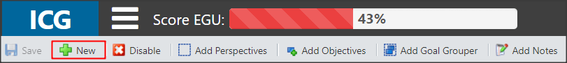
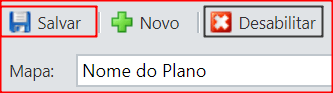
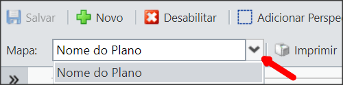
Click New to create a Strategy Map.
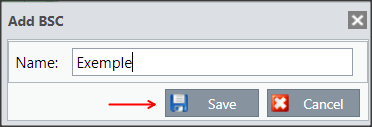
Enter the name of the Map.
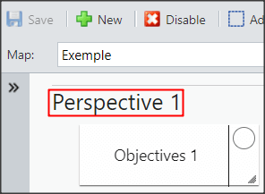
By default, the ICG will create Perspective 1 and Objectives 1 when the Map is created.
Double-click on the Perspective to edit the name.
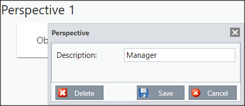
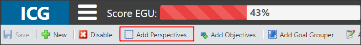
To add new perspectives, click on the icon below:
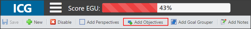
The next step is to add goals. You can double-click on the standard ICG Objective and make the changes you need or click on the icon below:
See below the tabs for the registration of Objectives:
[/et_pb_text][et_pb_tabs _builder_version=”4.9.10″ custom_margin=”-30px|25px||25px||true” custom_margin_tablet=”-15px||” custom_margin_phone=”” custom_margin_last_edited=”on|desktop” hover_enabled=”0″ sticky_enabled=”0″][et_pb_tab title=”Goals” _builder_version=”4.9.10″ hover_enabled=”0″ sticky_enabled=”0″]Choose in which perspective you want to register this objective and select the responsible user.
In case you use custom colors, select the color for this purpose.
Custom colors will influence the display.
Finally, write the description.
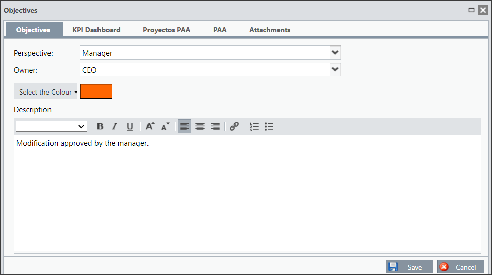
Don’t forget to save or go on to edit the next tab.
[/et_pb_tab][et_pb_tab title=”KPIs” _builder_version=”4.9.10″ hover_enabled=”0″ sticky_enabled=”0″]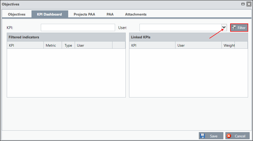
Select the desired user and click Filter.
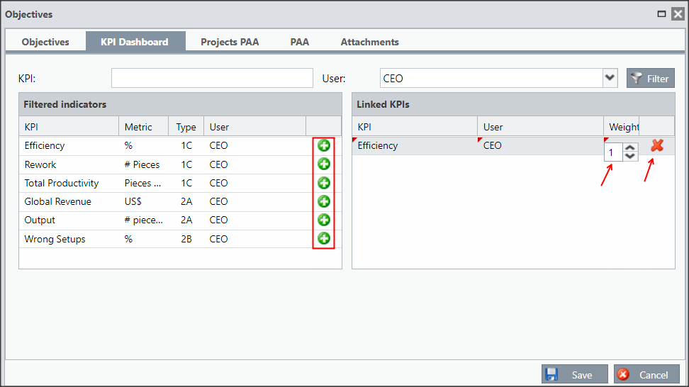
On the left side, all the user’s KPIs will appear, to link to the objective, click on the plus icon. The KPI will appear on the left side, you can set the weight or you can unlink it.
You can save the objective or proceed to edit the other tabs.
[/et_pb_tab][et_pb_tab title=”PAA Projects” _builder_version=”4.9.10″ hover_enabled=”0″ sticky_enabled=”0″]You can link PAA Projects, for this, click on Filter.
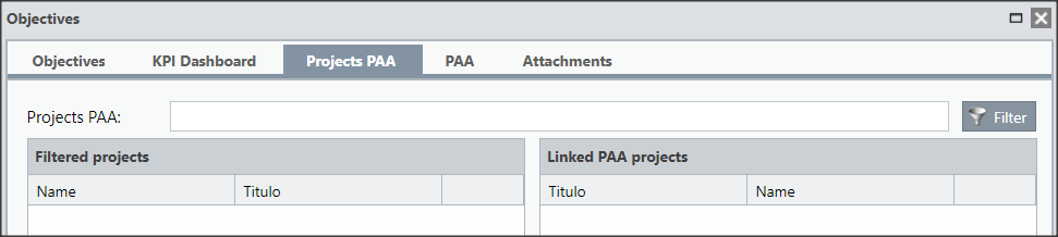
You can save the objective or proceed to edit the other tabs.
[/et_pb_tab][et_pb_tab title=”PAA” _builder_version=”4.9.10″ hover_enabled=”0″ sticky_enabled=”0″]You will be able to link PAA that you participate in.
Click filter to display the plans you are participating in and click the plus icon to link.
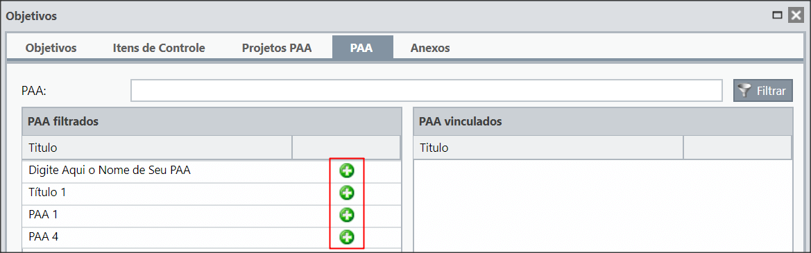
You can save the objective or proceed to edit the other tabs.
[/et_pb_tab][et_pb_tab title=”Attachments” _builder_version=”4.9.10″ hover_enabled=”0″ sticky_enabled=”0″]You will be able to attach files in your objective, for that, select the File in your computer and click on Send.
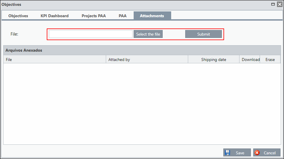
The attached files will be listed and you will have the option to download the file or delete it.
Don’t forget to Save when you finish editing the goal.
[/et_pb_tab][/et_pb_tabs][et_pb_text _builder_version=”4.9.10″ custom_margin=”-30px|25px||25px||true” custom_margin_tablet=”-15px||” custom_margin_phone=”” custom_margin_last_edited=”on|desktop”]After registering all your goals, you can group and create links between the Goals.
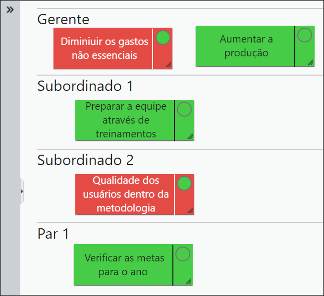
[/et_pb_text][et_pb_toggle title=”Goal Grouper” _builder_version=”4.9.10″ custom_margin=”-30px|25px||25px||true” custom_margin_tablet=”-15px||” custom_margin_phone=”” custom_margin_last_edited=”on|desktop”]After adding your goals and perspectives, you will have a similar view.
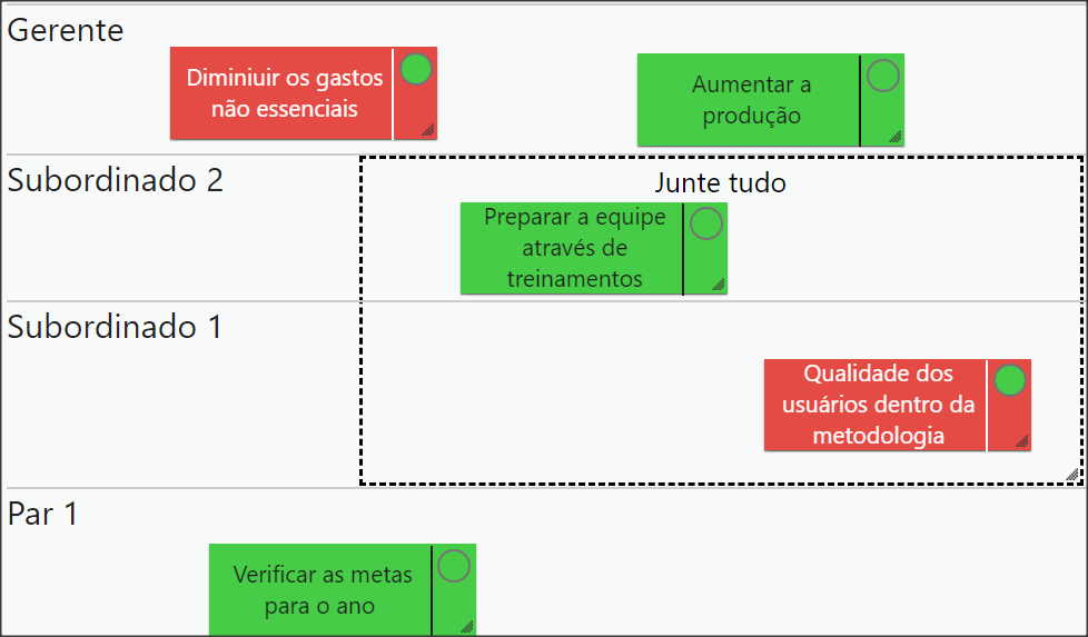
But you can also organize your goals through a grouper. To do this, click on the Add Objective Grouper icon.

You will be able to move your goals, perspectives and grouping in any way it fits you.
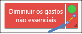
You can also create links between them. Click on the icon indicated below and drag the arrow to the goal you want.
You can Enable/Disable the connections with the button below:


In order for your calls and groupings to stay as you have adjusted, do not forget to save the Map. If you wish, you can delete the Map by clicking Disable.
The Strategy Map also allows you to include Notes and Pending Issues for your Goals.
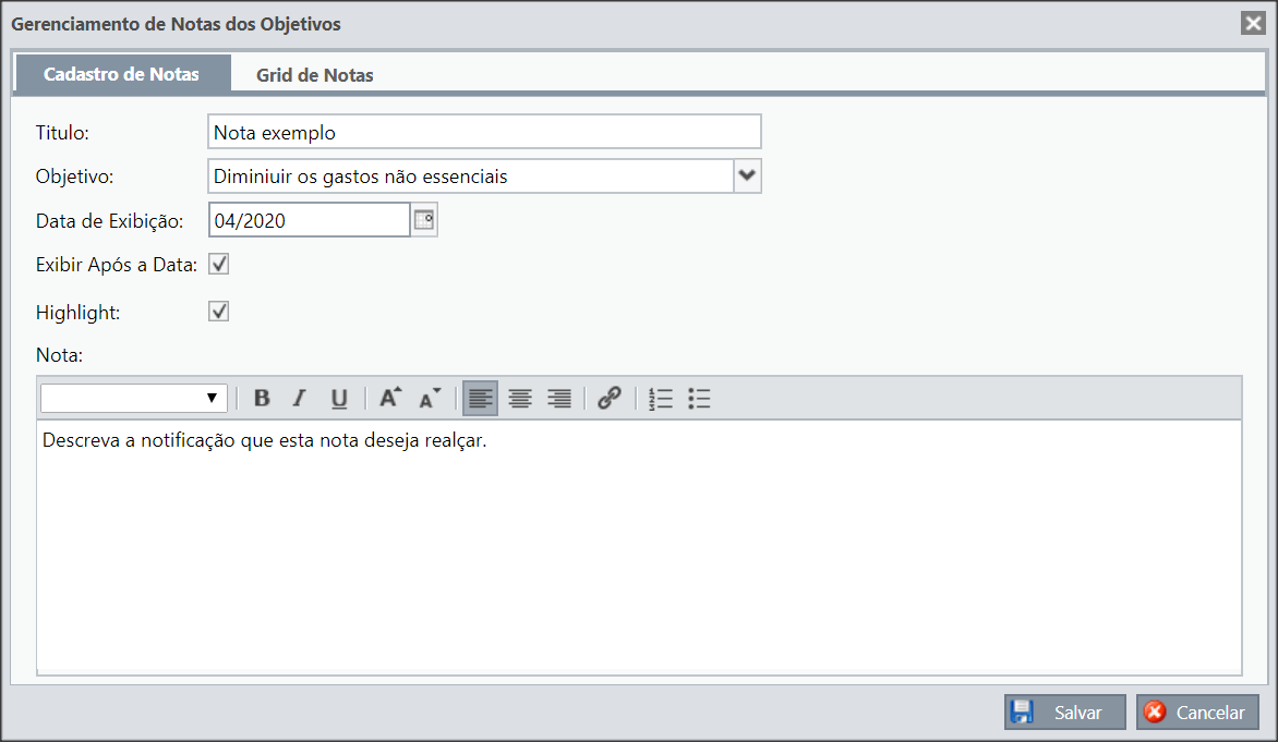
[/et_pb_text][et_pb_toggle title=”Grades” _builder_version=”4.9.10″ custom_margin=”-30px|25px||25px||true” custom_margin_tablet=”-15px||” custom_margin_phone=”” custom_margin_last_edited=”on|desktop”]You can add grades on a Map, for this, click on the icon below:

Enter the name of the grade, select the purpose for which it will be added and set the display date.
You can also select to show after the date and show in Highlight.
Finally, you can write the description of the grade.
When you click on the second tab, you will have the list of grade for each Objective. Remembering that if you do not select the option show after the date, after the expiration date the grade will not appear in the Grid.
In this window you can make quick settings, such as selecting whether the Highlight will appear, selecting whether the grade will remain in the grid after the date or else deleting the grade.
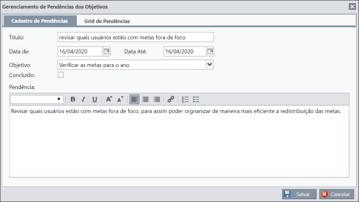
To add Pending KPIs to a Map, click on the icon below:

Enter the name of the pending KPI, select the date and inform which objective will be added. You can also indicate whether this pending has already been completed.
Finally, you can write the description of the to-do.
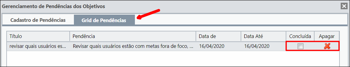
When you click on the second tab, you will have the backlog for each Objective. Remembering that only pending issues that have not been completed will be listed.
In this window you can mark it as completed or delete a pending issue.
[/et_pb_text][et_pb_text admin_label=”Tópico 2″ module_id=”topic_02″ _builder_version=”4.9.10″ text_font=”||||||||” text_letter_spacing=”1px” header_font=”|||||on|||” header_text_color=”#474747″ header_3_font=”|||||on|||” custom_margin=”30px|0px|10px|0px||true” custom_padding=”10px|||10px||false” border_color_all=”#0c71c3″ border_width_bottom=”3px” border_width_left=”3px”]
Configuration and Visualization
[/et_pb_text][et_pb_text _builder_version=”4.9.10″ custom_margin=”|25px||25px||true” custom_padding=”||0px”]In the settings you will define the limits of the bands for the objectives.
In the display you will configure how you will see your Strategy Map.
We’ll also show you how to navigate your Map.
In the Map settings you have two options:
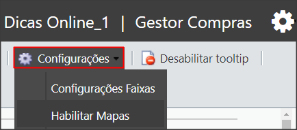
- Band Settings
You must adjust the Yellow Band according to the percentageyou need, the Red and Green Bands will be adjusted automatically.
Esses intervalos estão de acordo com a porcentagem de indicadores vinculados que estão fora do intervalo.
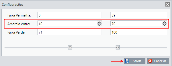
In the previous example, the Goal will be red when the percentage of green KPIs linked to a goal is between 0% and 39%, it will be yellow when the percentage of green KPIs is between 40% and 70% and green when the percentage of green KPIs is between 71% and 100%.
That is, if you link 5 KPIs with weight 1, each item will represent 20%.
If four of these KPIs are green, the goal will remain green, as the percentage of green indicators will be 80%.
Now, if three KPIs are green, the goal will turn yellow, since the percentage will be 60%.
Thus, if only one KPI is green, the percentage will be 20% and the goal will be red.
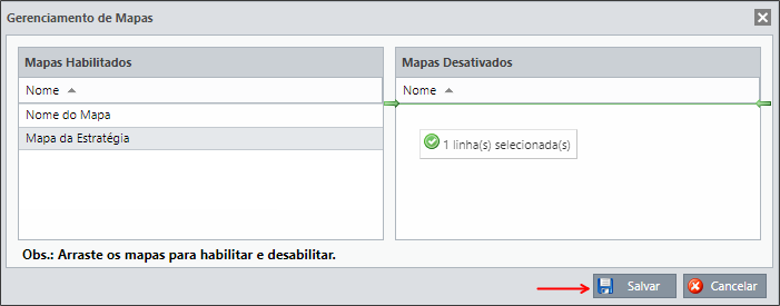
- Enable Maps
You can configure maps that are enabled or disabled.
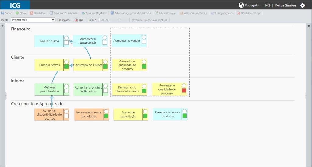
In the display you can configure whether you will see only the Goal, only the Result or both. You can also configure whether you will see the goal with the custom colors defined in the goal register or if you will see the color of the Goal.
By default, you will be able to see only the Result and the goal background with the color of the Goal.
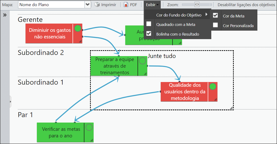
When enabling the goal and visualization by custom colors, my map will look like this:
Realize that a square with the Goal will appear in the objectives.
[/et_pb_toggle][et_pb_text _builder_version=”4.9.10″ custom_margin=”-30px|25px||25px||true” custom_margin_tablet=”-15px|||” custom_margin_phone=”” custom_margin_last_edited=”on|tablet”]Note that a square with the Goal will appear in the goals:
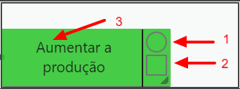
Colors:
The colors will be according to the Band Limits configuration seen previously.
1 – Represents the measurement of the months
In our case, the Result (circle) will be red when the number of KPIs with the green month measurement is less than or equal to 39%.
Yellow when the number of KPIs with the green measurement is between 40 and 70%.
Green when the number of KPIs with the green measurement is greater than 70%.
2 – Represents the Customer Band(Goal)
In our case, the Goal (square) will turn red when the number of KPIs with the green Customer Band is less than or equal to 39%.
Yellow when the quantity of KPIs with the green Customer Band is between 40 and 70%.
Green when the number of KPIs with the green Customer Band exceeds 70%.
3 – Represents the Customer band(Goal)
In this case, if the display is to show the Custom Color, this field will have the color defined in the objective’s register. If it is configured to display the color of the Goal, it will be exactly the color of the Customer Band seen in the previous option.
That is, the feature to view the Goal (square) may be disabled if you configure it to view the color of the Goal.
[/et_pb_text][et_pb_toggle title=”Lower Menu” _builder_version=”4.9.10″ custom_margin=”-30px|25px||25px||true” custom_margin_tablet=”-15px|||” custom_margin_phone=”” custom_margin_last_edited=”on|tablet”]
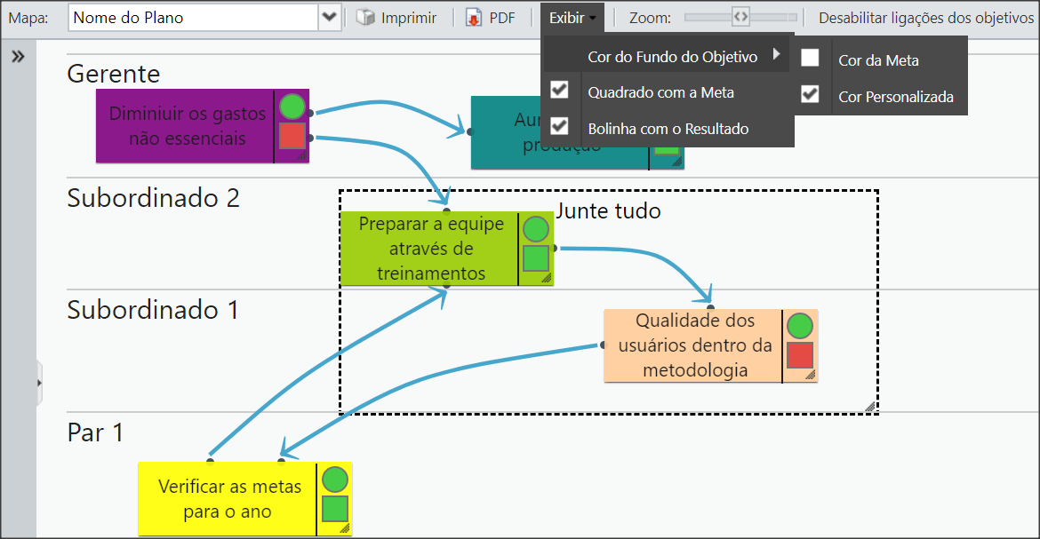
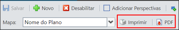
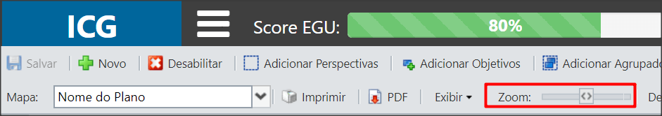
In the lower menu you can change and consult other Maps.
You can also print your map or generate a PDF.
It will also be possible to zoom in or out of the Map.
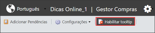
You can enable the tooltips:
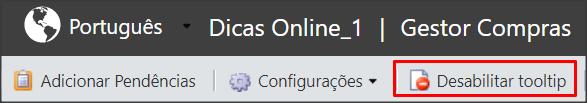
Or disable them:
With the tooltip enabled, when you hover over an goal, you will see some information about the Objective:
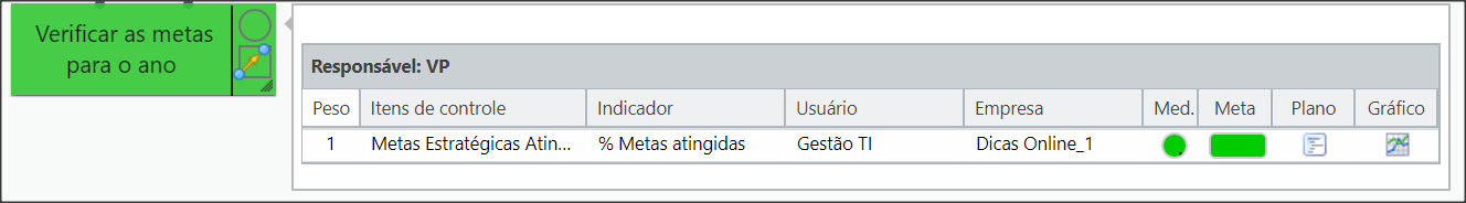
You will see the user responsible for the objective and the information for each linked KPI.
In the Measurement Column you will see the color of the Green Band and in the Goal column you will see the color of the Customer Band.
The icon in the Plan column will open the plan for the KPI (if any) and the icon in the Chart column will open the chart for the KPI.
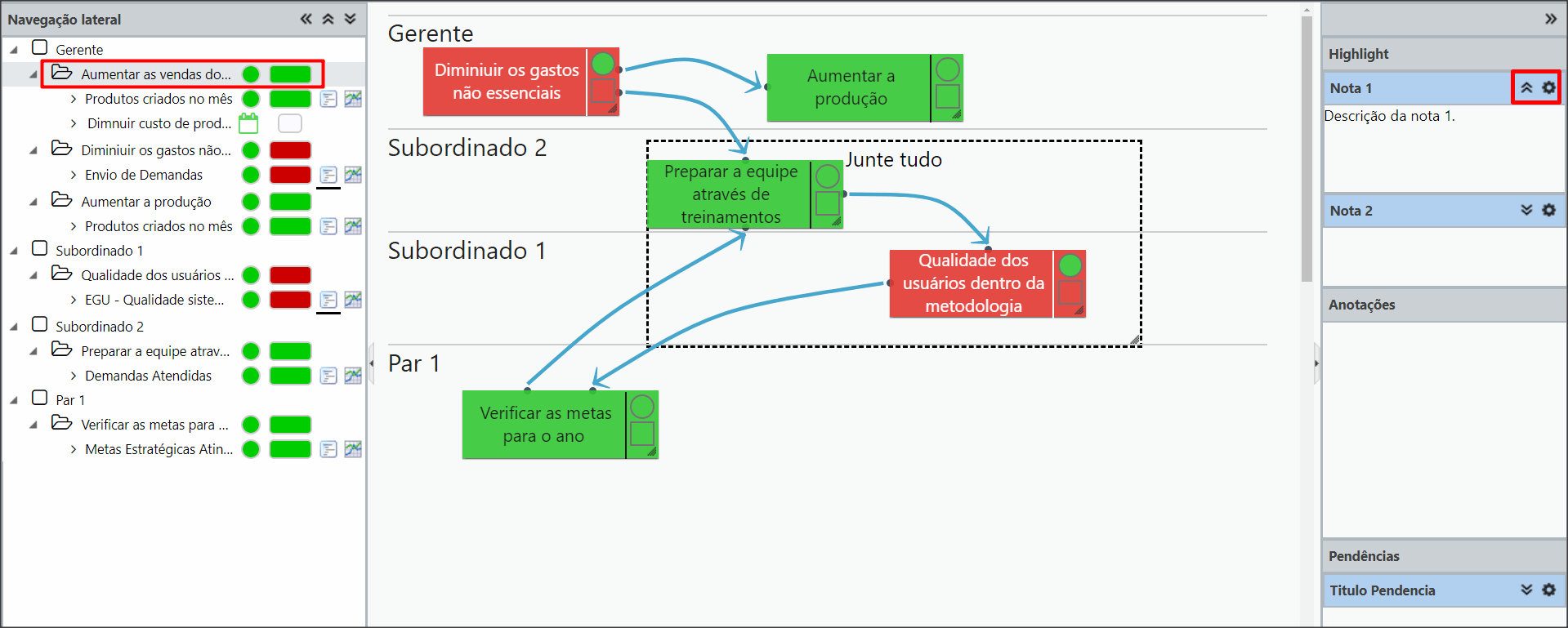
Side Navigation
[/et_pb_text][et_pb_text _builder_version=”4.9.10″ custom_margin=”|25px|0px|25px||true” custom_padding=”||0px”]On the left of your dashboard, you can check all the perspectives with their respective objectives and also check the KPIs linked to the goals.
ou can use the indicated icons to hide navigation, retract everything or expand everything.
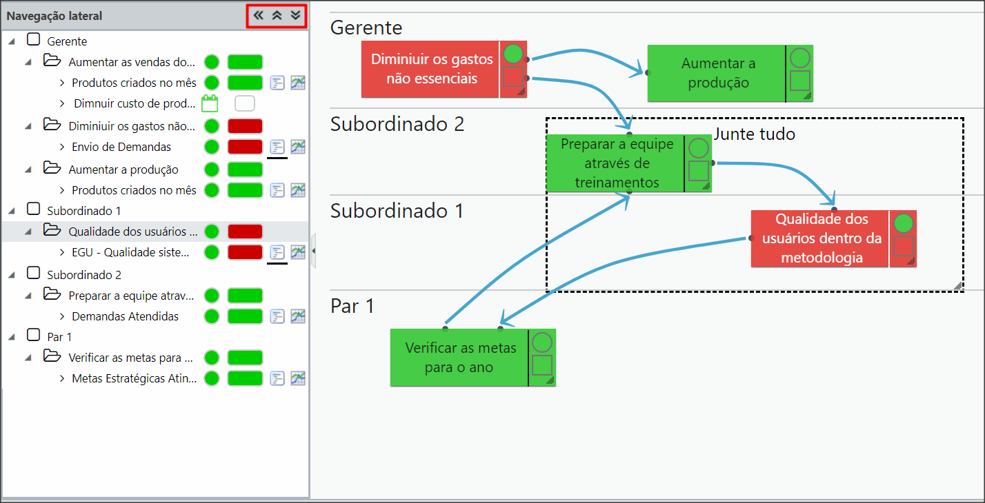
When you click on an Objective, the notes that have Highlight marked, the annotations and to-dos of that objective will appear on the right.
To see more details of the information, click on the arrows indicated below.
By clicking on the gear icon, you can edit the information.
Guest Access
[/et_pb_text][et_pb_text _builder_version=”4.9.10″ custom_margin=”|25px|0px|25px||true” custom_padding=”||0px”]In this option, you can provide access to view your company’s Maps for people who do not have KPIs.
That is, with this feature, the user will not go through the indicators dashboard, he will be directed directly to the Strategy Map.
Note that all creation or change buttons in the Strategy Map menu are disabled.
Only the Map, Print, PDF and View buttons are enabled.
Configuration
To enable this feature, just create a new Profile enabling only the Access BSC Only permission.
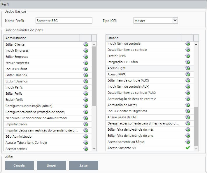
IMPORTANT:
This permission overrides any other enabled permissions for the profile. Therefore, we recommend that you create a new profile that exclusively contains this permission.
[/et_pb_text][/et_pb_column][et_pb_column type=”1_5″ _builder_version=”3.25″ custom_padding=”|||” custom_padding__hover=”|||”][et_pb_image src=”https://suporte.quattrus.com/wp-content/uploads/2021/03/Artboard-2-copy-5.jpg” title_text=”Artboard 2 copy 5″ align_tablet=”center” align_phone=”” align_last_edited=”on|desktop” disabled_on=”on|on|” admin_label=”ESP – Banner – Contato Suporte” _builder_version=”4.9.2″ z_index=”0″ always_center_on_mobile=”on” saved_tabs=”all” locked=”off”][/et_pb_image][et_pb_image src=”https://suporte.quattrus.com/wp-content/uploads/2021/03/Prancheta-1.jpg” title_text=”Prancheta 1″ url=”https://www.qualitin.com.br/consultoria/” url_new_window=”on” align_tablet=”center” align_phone=”” align_last_edited=”on|desktop” disabled_on=”on|on|” admin_label=”Banner – Consultoria” _builder_version=”4.9.2″ max_width=”100%” saved_tabs=”all” locked=”off”][/et_pb_image][/et_pb_column][/et_pb_row][/et_pb_section]