

 Português
 Español
In Quattrus, the sidebar menu brings together the general functionalities of the software.
By hovering your mouse over the sidebar icons, you can automatically expand and collapse the menu features to view the options in each submenu, without changing the layout of the KPI dashboard.
By clicking on the three bar icon and the arrows, you expand or collapse the menu manually. In this case, the Quattrus dashboard layout will adjust itself.
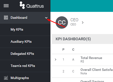
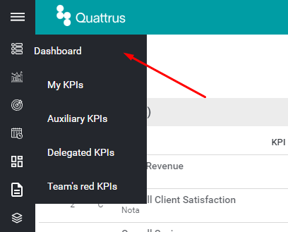
Dashboard
In the Dashboard menu, you will see your KPIs according to the settings you have applied.
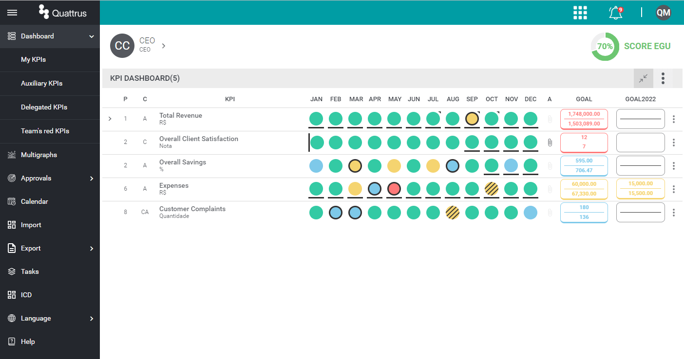
- My KPIs: are the user’s main KPIs – those that are of most importance in the management
- Auxiliary KPIs: are the secondary KPIs – those of less importance or that serve as reference for the management
- Delegated KPIs: are the KPIs where the user is co-responsible for the management.
- Team’s red KPIs: are the KPIs of your team members that have the headlight of the month or goal in red. Therefore, they are KPIs that deserve your attention, for analysis and decision making together with the user responsible for the KPI.
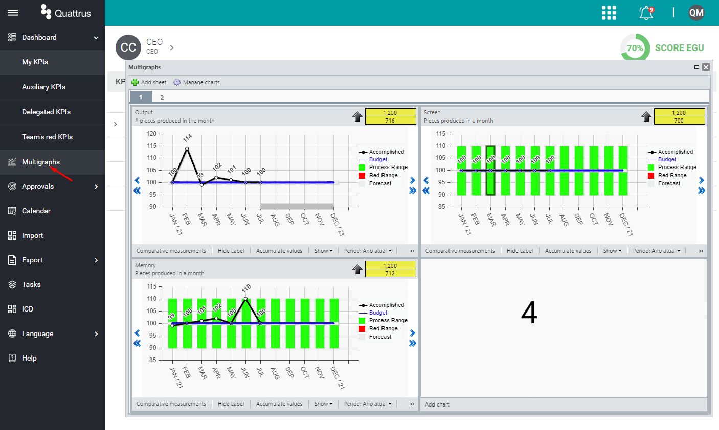
Multigraphs
In this option, you open the Multigraphs screen, where you can set each multigraphs tab to contain up to 4 charts per page. After finishing these settings they will remain visible in the future.
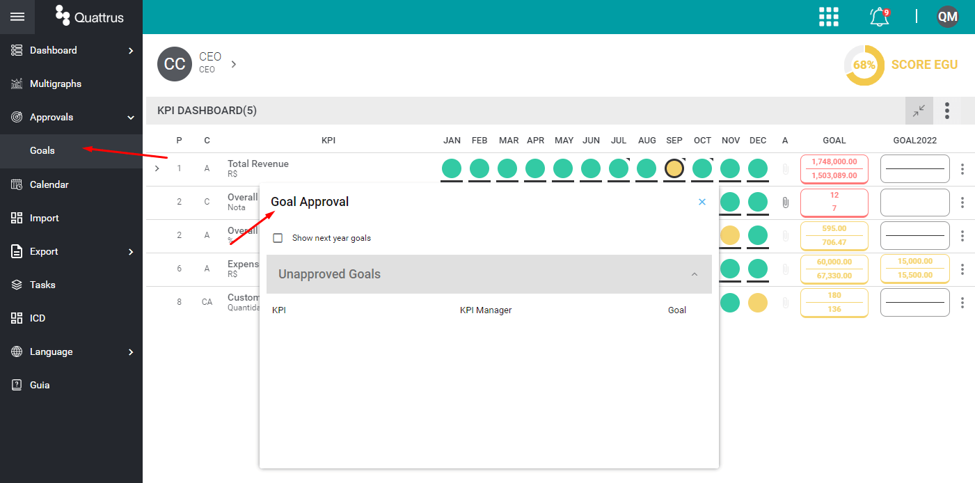
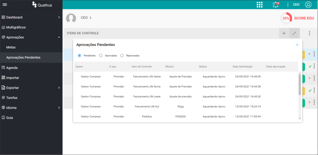
Approvals
Here we have the options for Goal and Forecast approvals.
When you click on the Goals option, the system opens a screen with the list of your team’s goals awaiting your decision.
Likewise, when you click Forecasts, the system opens a screen with a list of your team’s KPIs that have had some change in the forecasts and are awaiting your decision.
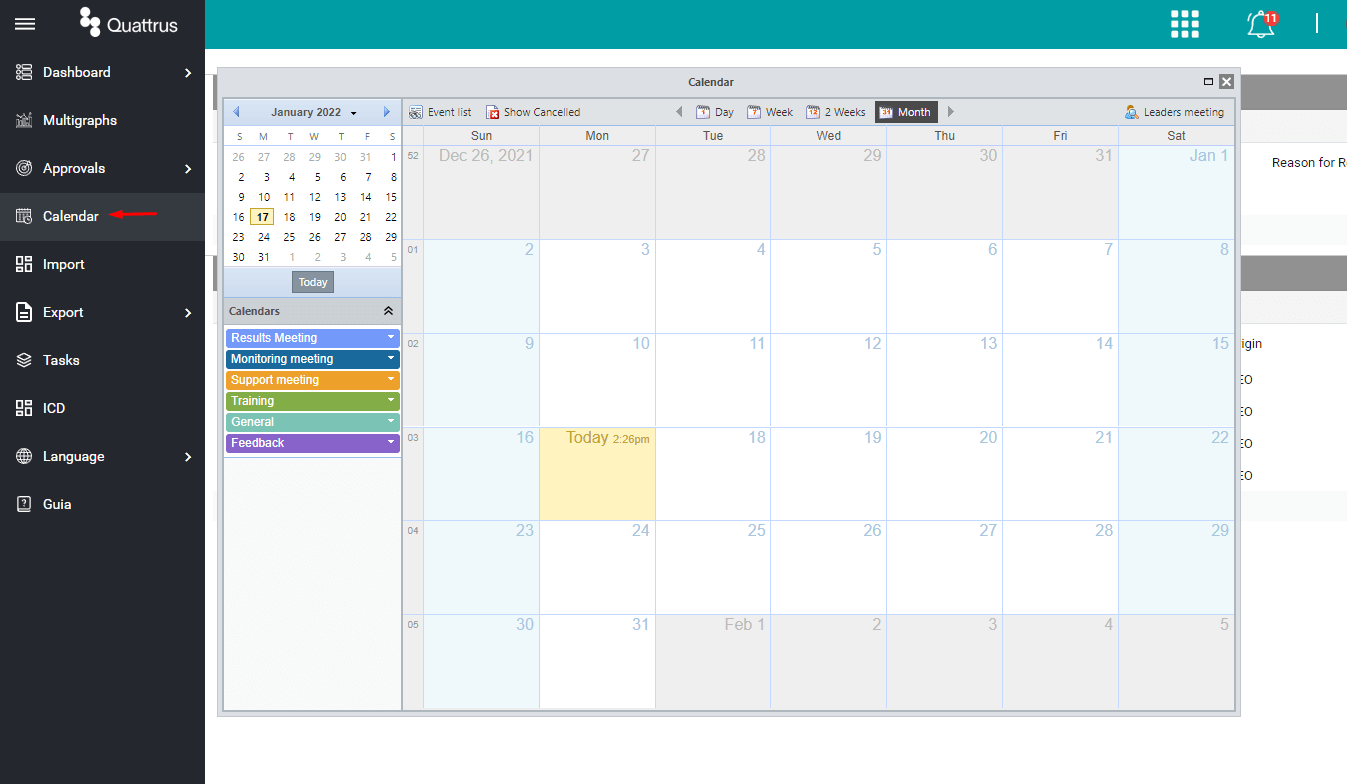
Calendar
In Calendar, the system opens the screen for creating or updating your meetings. Either as a leader or as a participant.
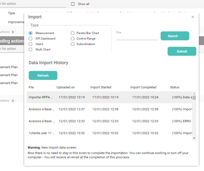
Import
In the Import menu, the system opens the screen for importing the data that will show up on your dashboard such as measurements, KPIs, users, multigraphs, etc.
Export
Here you will find some options to extract data and information from Quattrus.
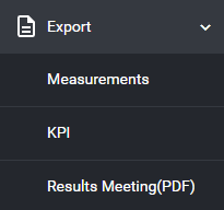
- Measurements: the system opens a screen where you must select the desired KPIs and the respective period to extract the data from the system in an Excel file format. This same file can be edited and used later to import information into the system.
- KPI: the system automatically generates an Excel file for download containing the list of user KPIs.
- Results Meeting (PDF): the system opens a screen where you can choose which information will be part of the report. At the end, the system sends the report by e-mail to the user logged on to the system.
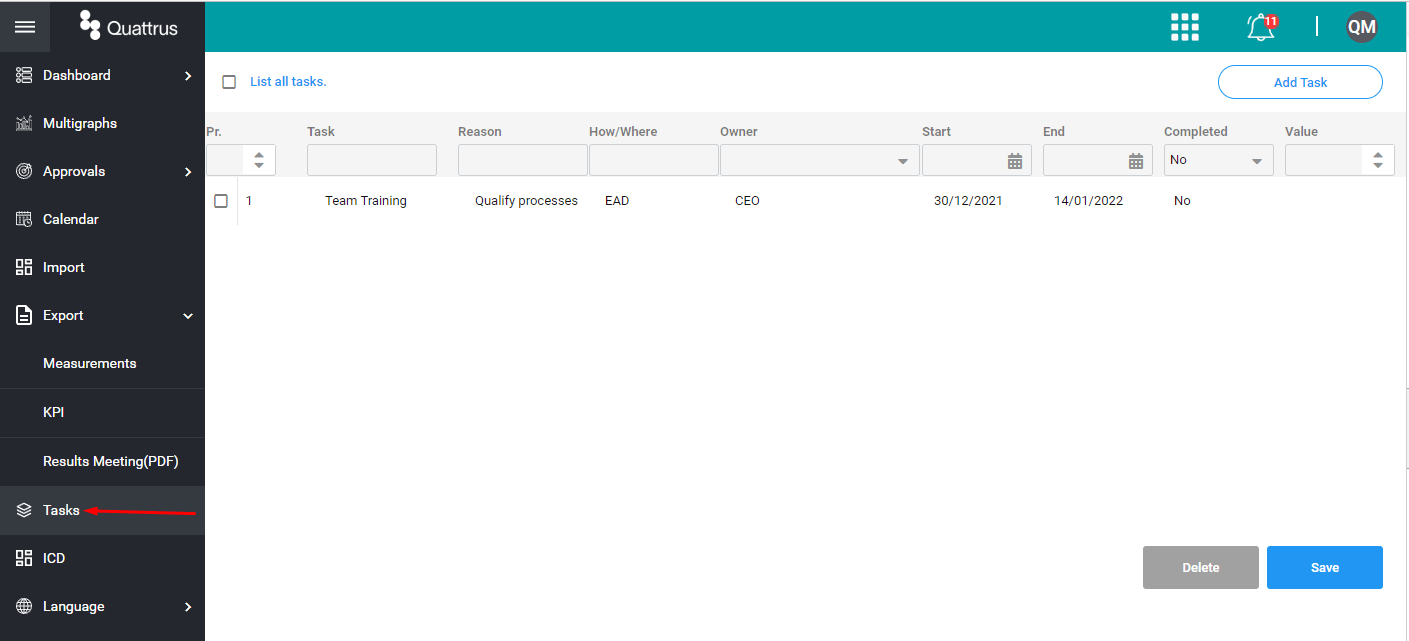
Tasks
Here Quattrus opens a screen for the creation of single Tasks, using the 5W2H format.
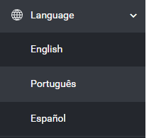
Language
In this option, the user can adjust the language of the software by choosing between English, Portuguese and Spanish.
Help
Here the system displays a help screen containing labels for the main elements regarding Headlights and Goals

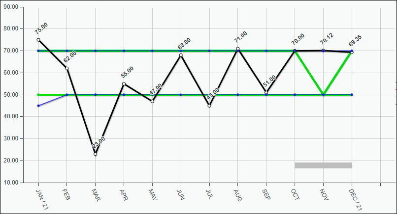
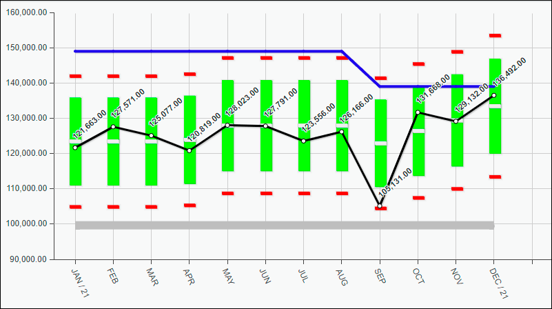
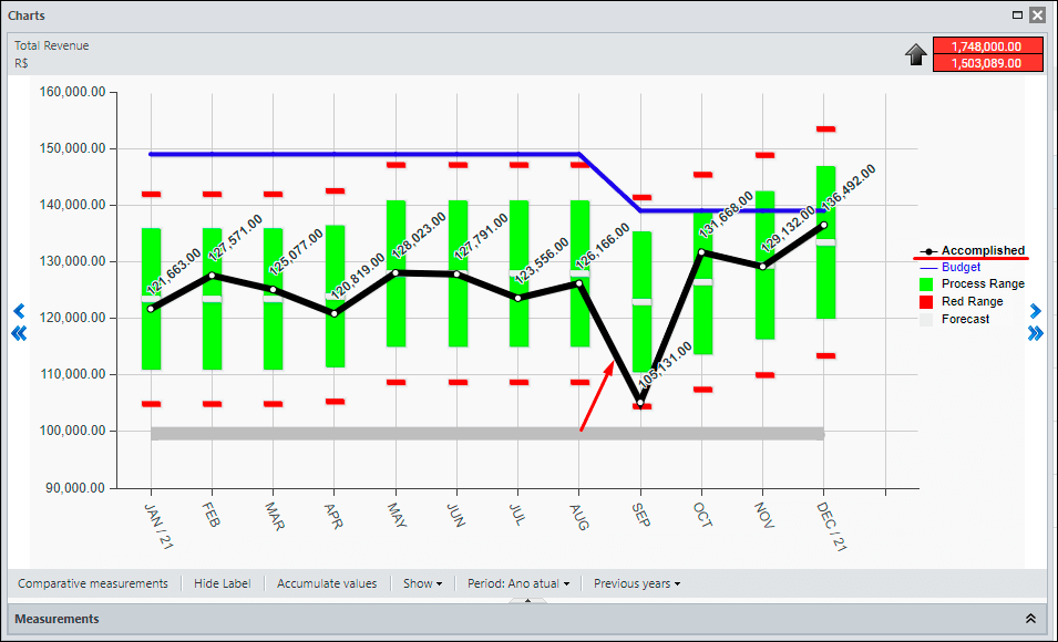
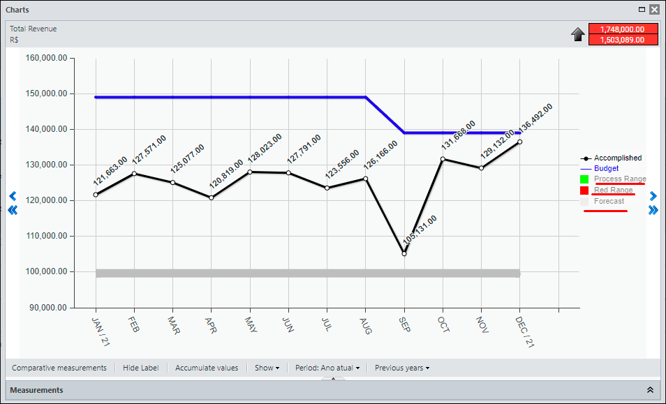
The KPI Chart is the visual way to demonstrate your metric’s accomplished, forecast, and goal data over the period. You can see below an overview of the main elements and features of the Chart.
Data Area
In the central part of the screen you see the data for your chart. The scale of the chart is automatically adjusted according to the variation of the displayed values.
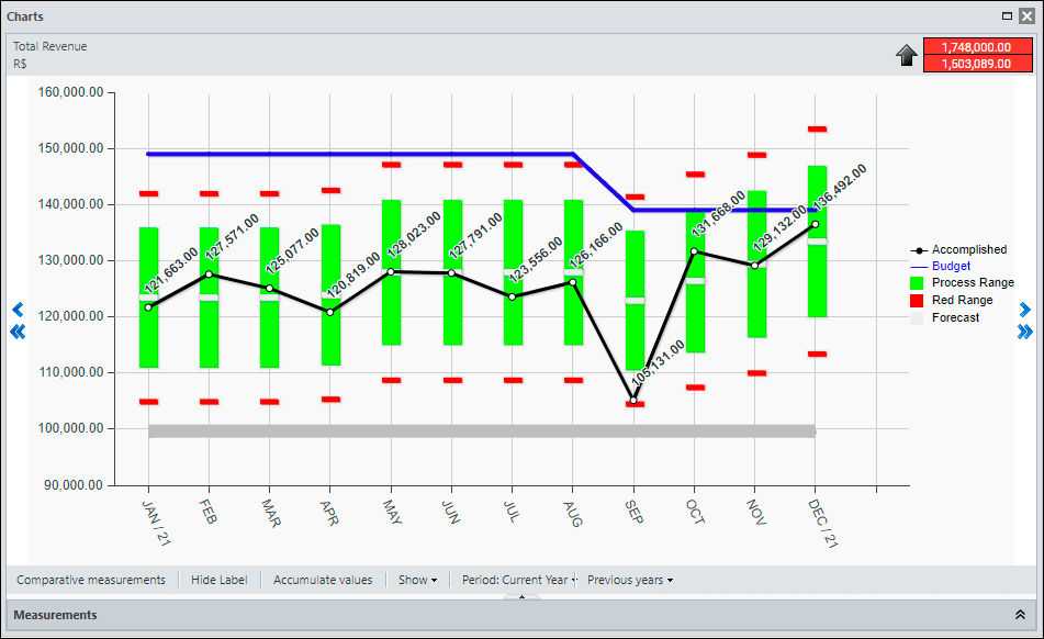
If you rest the mouse on top of any chart element, the system will show a tooltip with all the details of the month.
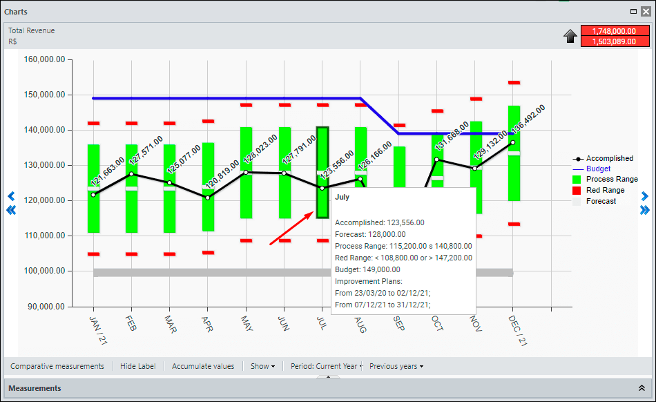
Green Range View
In Type 1 KPIs (Inform Lower and Upper Limit) the Green Range is displayed as continuous lines over the months.
In Type 2 KPIs (Inform forecast and tolerance margin) the Green Range is shown as a vertical bar each month. Its size varies according to the values configured in the KPI Settings.
Labels
To the right of the Data Area of the chart you will find the labels.
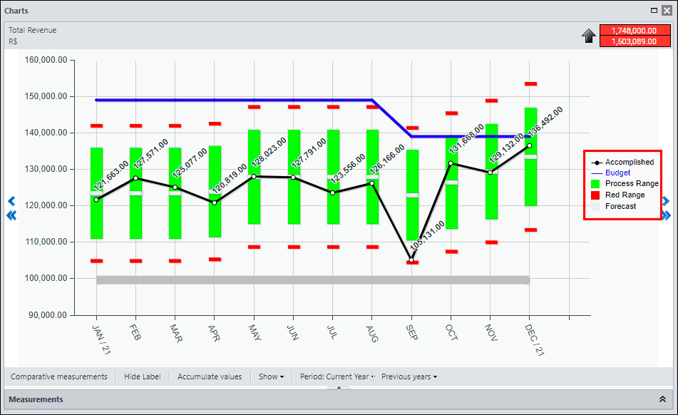
If you rest the mouse on one of the labels, the system highlights the respective item in the chart’s data area.
By clicking on the item, the system hides or displays the respective item in the chart data area.
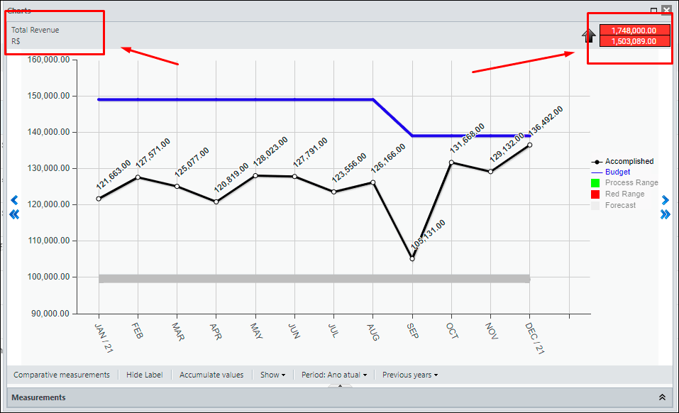
Top
At the top of the screen you have the name of the KPI that is being displayed, its indicator, the direction of the Good When and the Goal of this KPI.
Bottom
In the bottom of the screen, you will find several viewing options for the chart data:
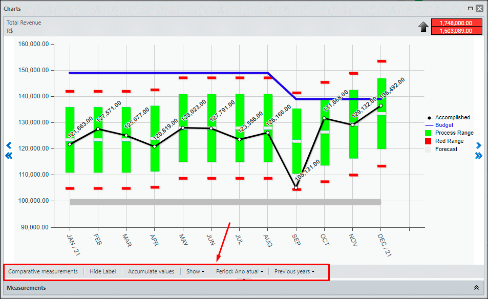
- Comparative Measurements: allows you to include the curve of the Actual of one or more KPIs in the chart.
- Hide Label: Hides or Shows the label items on the chart.
- Accumulate Values: Displays the values in cumulative form (Year-To-Date) over the period
- Show: Hides or shows vertical and horizontal lines and values from the chart’s data area
- Period: Changes the number of months visible on the chart (X axis)
- Previous Years: Shows or Hides the Actual value from previous years comparatively.