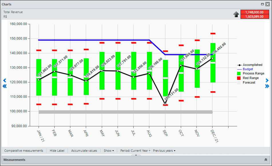
The KPI Chart is the visual way to demonstrate your metric’s accomplished, forecast, and goal data over the period. You can see below an overview of the main elements and features of the Chart.
Data Area
In the central part of the screen you see the data for your chart. The scale of the chart is automatically adjusted according to the variation of the displayed values.
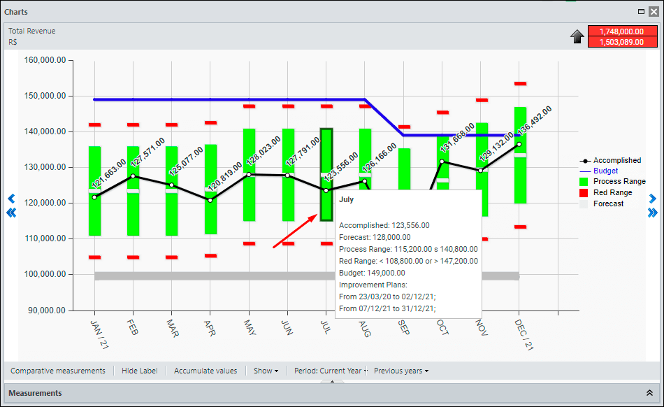
If you rest the mouse on top of any chart element, the system will show a tooltip with all the details of the month.
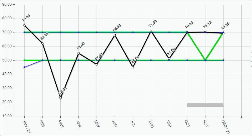
Green Range View
In Type 1 KPIs (Inform Lower and Upper Limit) the Green Range is displayed as continuous lines over the months.
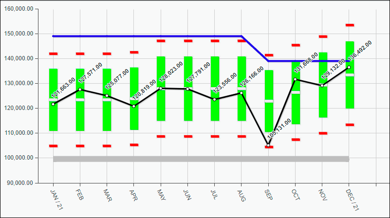
In Type 2 KPIs (Inform forecast and tolerance margin) the Green Range is shown as a vertical bar each month. Its size varies according to the values configured in the KPI Settings.
Labels
To the right of the Data Area of the chart you will find the labels.
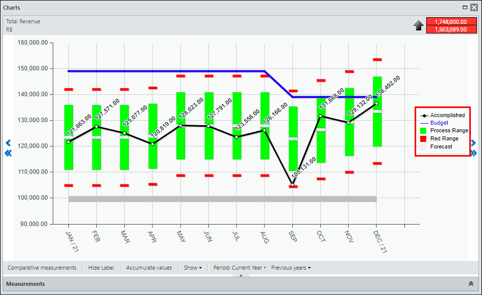
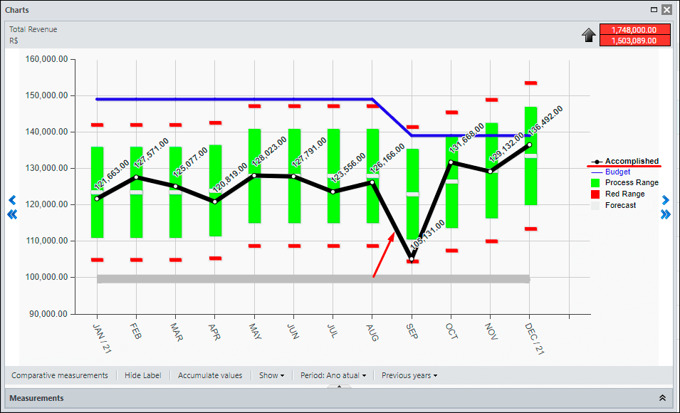
If you rest the mouse on one of the labels, the system highlights the respective item in the chart’s data area.
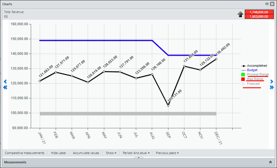
By clicking on the item, the system hides or displays the respective item in the chart data area.
Top
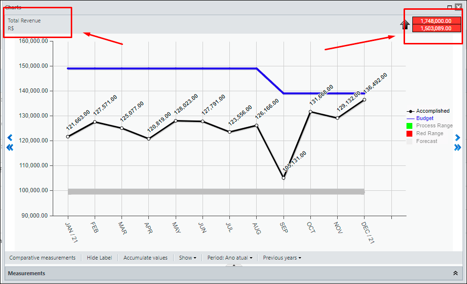
At the top of the screen you have the name of the KPI that is being displayed, its indicator, the direction of the Good When and the Goal of this KPI.
Bottom
In the bottom of the screen, you will find several viewing options for the chart data:
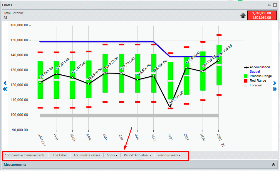
- Comparative Measurements: allows you to include the curve of the Actual of one or more KPIs in the chart.
- Hide Label: Hides or Shows the label items on the chart.
- Accumulate Values: Displays the values in cumulative form (Year-To-Date) over the period
- Show: Hides or shows vertical and horizontal lines and values from the chart’s data area
- Period: Changes the number of months visible on the chart (X axis)
- Previous Years: Shows or Hides the Actual value from previous years comparatively.


 Português
 Español