[et_pb_section fb_built=”1″ _builder_version=”4.4.8″ global_colors_info=”{}”][et_pb_row column_structure=”1_5,3_5,1_5″ module_class=” et_pb_row_fullwidth” _builder_version=”3.25″ width=”89%” width_tablet=”80%” width_phone=”” width_last_edited=”on|desktop” max_width=”89%” max_width_tablet=”80%” max_width_phone=”” max_width_last_edited=”on|desktop” make_fullwidth=”on” global_colors_info=”{}”][et_pb_column type=”1_5″ _builder_version=”3.25″ custom_padding=”|||” global_colors_info=”{}” custom_padding__hover=”|||”][et_pb_text disabled_on=”on|on|” admin_label=”Iniciantes – Navegação vertical” _builder_version=”4.9.6″ text_font=”|600|||||||” text_text_color=”#727272″ header_line_height=”1.1em” header_2_font=”|800||||on|||” header_2_text_align=”left” header_2_text_color=”#494949″ header_3_font=”|600|||||||” header_3_text_color=”#494949″ header_3_font_size=”14px” header_3_line_height=”1.2em” max_width=”100%” module_alignment=”left” global_module=”12403″ saved_tabs=”all” global_colors_info=”{}”]
[/et_pb_text][et_pb_text disabled_on=”on|on|” admin_label=”Artigos Relacionados” _builder_version=”4.14.4″ text_font=”|600|||||||” text_text_color=”#727272″ header_line_height=”1.1em” header_2_font=”|800||||on|||” header_2_text_align=”left” header_2_text_color=”#494949″ header_3_font=”|600|||||||” header_3_text_color=”#494949″ header_3_font_size=”14px” header_3_line_height=”1.2em” module_alignment=”left” link_option_url_new_window=”on” z_index_tablet=”500″ text_text_shadow_horizontal_length_tablet=”0px” text_text_shadow_vertical_length_tablet=”0px” text_text_shadow_blur_strength_tablet=”1px” link_text_shadow_horizontal_length_tablet=”0px” link_text_shadow_vertical_length_tablet=”0px” link_text_shadow_blur_strength_tablet=”1px” ul_text_shadow_horizontal_length_tablet=”0px” ul_text_shadow_vertical_length_tablet=”0px” ul_text_shadow_blur_strength_tablet=”1px” ol_text_shadow_horizontal_length_tablet=”0px” ol_text_shadow_vertical_length_tablet=”0px” ol_text_shadow_blur_strength_tablet=”1px” quote_text_shadow_horizontal_length_tablet=”0px” quote_text_shadow_vertical_length_tablet=”0px” quote_text_shadow_blur_strength_tablet=”1px” header_text_shadow_horizontal_length_tablet=”0px” header_text_shadow_vertical_length_tablet=”0px” header_text_shadow_blur_strength_tablet=”1px” header_2_text_shadow_horizontal_length_tablet=”0px” header_2_text_shadow_vertical_length_tablet=”0px” header_2_text_shadow_blur_strength_tablet=”1px” header_3_text_shadow_horizontal_length_tablet=”0px” header_3_text_shadow_vertical_length_tablet=”0px” header_3_text_shadow_blur_strength_tablet=”1px” header_4_text_shadow_horizontal_length_tablet=”0px” header_4_text_shadow_vertical_length_tablet=”0px” header_4_text_shadow_blur_strength_tablet=”1px” header_5_text_shadow_horizontal_length_tablet=”0px” header_5_text_shadow_vertical_length_tablet=”0px” header_5_text_shadow_blur_strength_tablet=”1px” header_6_text_shadow_horizontal_length_tablet=”0px” header_6_text_shadow_vertical_length_tablet=”0px” header_6_text_shadow_blur_strength_tablet=”1px” box_shadow_horizontal_tablet=”0px” box_shadow_vertical_tablet=”0px” box_shadow_blur_tablet=”40px” box_shadow_spread_tablet=”0px” global_module=”10128″ saved_tabs=”all” global_colors_info=”{}”]
Artigos Relacionados
[/et_pb_text][/et_pb_column][et_pb_column type=”3_5″ _builder_version=”3.25″ custom_padding=”|||” global_colors_info=”{}” custom_padding__hover=”|||”][et_pb_post_title meta=”off” featured_image=”off” _builder_version=”3.17.6″ title_font=”|700||||on|||” title_font_size=”36px” global_colors_info=”{}”]
[/et_pb_post_title][et_pb_tabs _builder_version=”3.26.3″ global_colors_info=”{}”][et_pb_tab title=”Gráficos” _builder_version=”3.26.3″ global_colors_info=”{}”]
Para abrir o gráfico de um Item de Controle, selecione o item desejado e clique no ícone abaixo:
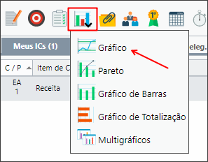
Abrirá o gráfico do item secionado.
Para visualizar o gráfico de outro item, basta selecioná-lo. Não é preciso fechar a janela de gráfico.
Exemplo de um item do tipo 1C: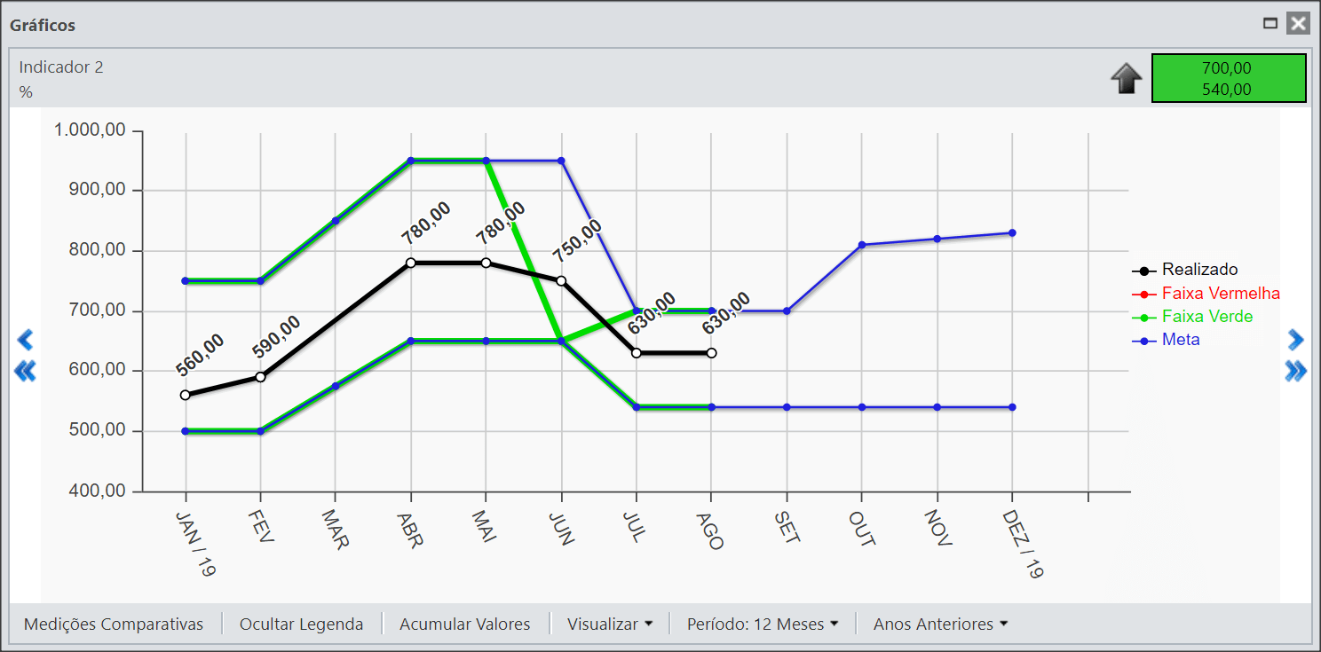
Exemplo de itens do tipo 2A, 2B e 2C: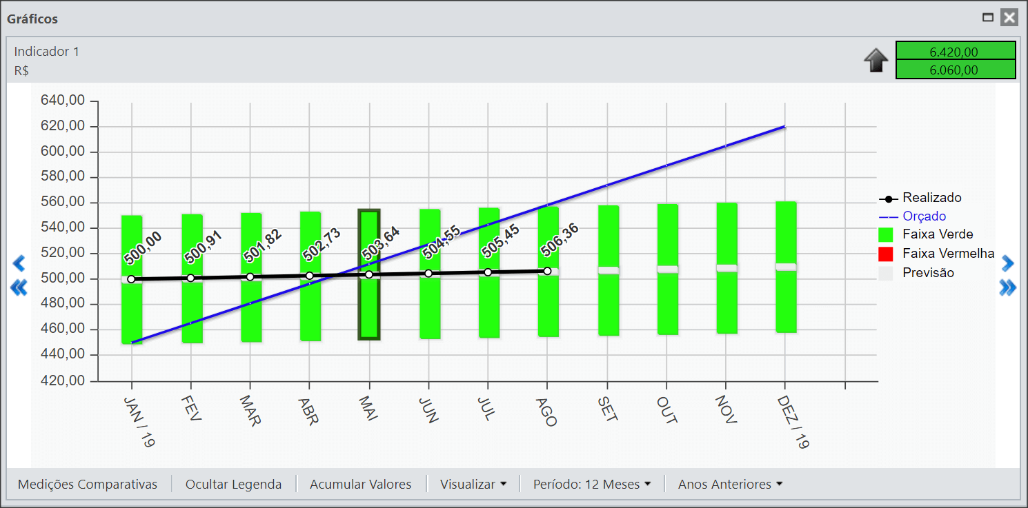
Na parte superior estará indicado o nome e o indicador do Item de Controle.
Também será possível visualizar a Meta. A seta indica se o item é bom para mais  , para menos
  ou igual
  .
.

No exemplo do Item 2B, há uma linha cinza abaixo do gráfico. Esta linha significa que naqueles meses há um plano de ação cadastrado.
- Na parte inferior do gráfico há algumas opções que o usuário poderá utilizar.
Você poderá Ocultar Legenda, deixando maior espaço de visualização para o gráfico.
- No botão Visualizar, você poderá ocultar as linhas horizontais e verticais, assim como os valores do realizado.
- No Período, você poderá escolher se deseja visualizar 12 meses ou 24 meses.
- No botão Anos Anteriores, caso você tenha valores de referência, poderá exibir no gráfico os últimos três anos.
Para saber mais funções do gráfico, acesse o artigo Gráfico do Item de Controle.
[/et_pb_tab][et_pb_tab title=”Gráfico de Totalização” _builder_version=”3.22.5″ global_colors_info=”{}”]
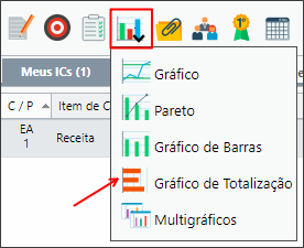
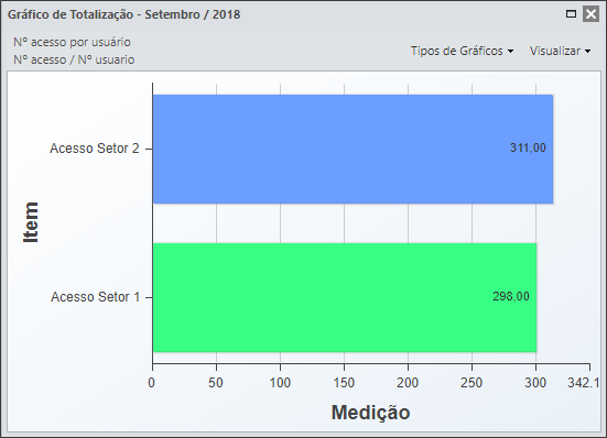
Quando um item é totalizado, você poderá visualizar o gráfico de totalização deste item. Para isto, selecione o item desejado e clique no ícone abaixo:
Você poderá identificar o quanto cada item está influenciando para o resultado do seu item totalizado.
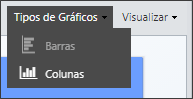
Na parte superior você poderá definir o tipo de gráfico. Por padrão, ele será do tipo de Barras, mas você poderá alterar para Colunas.
Você também poderá definir o tipo de visualização, se irá mostrar o realizado ou a diferença entre o realizado e o previsto.
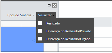
Abaixo está um exemplo de um gráfico de Colunas com a visualização trazendo a diferença entre o realizado e o previsto.
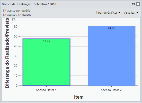
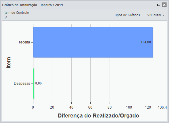
Abaixo está um exemplo de um gráfico de barras com a exibição que mostra a diferença entre o realizado e o que foi orçado.
[/et_pb_tab][/et_pb_tabs][/et_pb_column][et_pb_column type=”1_5″ _builder_version=”3.25″ custom_padding=”|||” global_colors_info=”{}” custom_padding__hover=”|||”][et_pb_image src=”https://suporte.quattrus.com/wp-content/uploads/2019/02/banner-suporte-01.png” title_text=”banner-suporte-01″ align_tablet=”center” align_phone=”” align_last_edited=”on|desktop” disabled_on=”on|on|” admin_label=”ESP – Banner – Contato Suporte” _builder_version=”4.14.4″ z_index=”0″ always_center_on_mobile=”on” global_module=”10498″ saved_tabs=”all” locked=”off” global_colors_info=”{}”][/et_pb_image][/et_pb_column][/et_pb_row][et_pb_row column_structure=”1_5,1_5,1_5,1_5,1_5″ disabled_on=”on|on|” module_class=” et_pb_row_fullwidth” _builder_version=”3.25″ width=”89%” width_tablet=”80%” width_phone=”” width_last_edited=”on|desktop” max_width=”89%” max_width_tablet=”80%” max_width_phone=”” max_width_last_edited=”on|desktop” make_fullwidth=”on” global_colors_info=”{}”][et_pb_column type=”1_5″ _builder_version=”3.25″ custom_padding=”|||” global_colors_info=”{}” custom_padding__hover=”|||”][/et_pb_column][et_pb_column type=”1_5″ _builder_version=”3.25″ custom_padding=”|||” global_colors_info=”{}” custom_padding__hover=”|||”][et_pb_button button_url=”https://suporte.quattrus.com/passo-5-inserindo-medicoes/” button_text=”ANTERIOR” button_alignment=”left” _builder_version=”3.19.17″ custom_button=”on” button_text_size=”14px” button_text_color=”#434343″ button_bg_color=”#f0f0f0″ button_border_width=”1px” button_border_color=”#dddddd” button_use_icon=”off” global_colors_info=”{}”]
[/et_pb_button][/et_pb_column][et_pb_column type=”1_5″ _builder_version=”3.25″ custom_padding=”|||” global_colors_info=”{}” custom_padding__hover=”|||”][et_pb_text _builder_version=”3.27.4″ text_text_color=”#6b6b6b” text_letter_spacing=”4px” text_orientation=”center” custom_margin=”|-73px||-73px” global_colors_info=”{}”]
1 2 3 4 5 6 7 8 9 10 11 12
[/et_pb_text][/et_pb_column][et_pb_column type=”1_5″ _builder_version=”3.25″ custom_padding=”|||” global_colors_info=”{}” custom_padding__hover=”|||”][et_pb_button button_url=”https://suporte.quattrus.com/passo-7-entendendo-os-icones/” button_text=”PRÓXIMO” button_alignment=”right” _builder_version=”3.19.17″ custom_button=”on” button_text_size=”14px” button_text_color=”#434343″ button_bg_color=”#f0f0f0″ button_border_width=”1px” button_border_color=”#dddddd” button_use_icon=”off” custom_css_before=”border: #ddd;||” global_colors_info=”{}”]
[/et_pb_button][/et_pb_column][et_pb_column type=”1_5″ _builder_version=”3.25″ custom_padding=”|||” global_colors_info=”{}” custom_padding__hover=”|||”][/et_pb_column][/et_pb_row][et_pb_row disabled_on=”||on” _builder_version=”3.25″ background_size=”initial” background_position=”top_left” background_repeat=”repeat” global_colors_info=”{}”][et_pb_column type=”4_4″ _builder_version=”3.25″ custom_padding=”|||” global_colors_info=”{}” custom_padding__hover=”|||”][et_pb_button button_url=”https://suporte.quattrus.com/passo-5-inserindo-medicoes/” button_text=”ANTERIOR” button_alignment=”center” _builder_version=”3.19.17″ custom_button=”on” button_text_size=”14px” button_text_color=”#434343″ button_bg_color=”#f0f0f0″ button_border_width=”1px” button_border_color=”#dddddd” button_use_icon=”off” global_colors_info=”{}”]
[/et_pb_button][et_pb_text _builder_version=”3.27.4″ text_text_color=”#6b6b6b” text_letter_spacing=”4px” text_orientation=”center” global_colors_info=”{}”]
1 2 3 4 5 6 7 8 9 10 11 12
[/et_pb_text][et_pb_button button_url=”https://suporte.quattrus.com/passo-7-entendendo-os-icones/” button_text=”PRÓXIMO” button_alignment=”center” _builder_version=”3.19.17″ custom_button=”on” button_text_size=”14px” button_text_color=”#434343″ button_bg_color=”#f0f0f0″ button_border_width=”1px” button_border_color=”#dddddd” button_use_icon=”off” custom_css_before=”border: #ddd;||” global_colors_info=”{}”]
[/et_pb_button][/et_pb_column][/et_pb_row][/et_pb_section]


 Português
 Español