

 Português
 Español
Related posts
[/et_pb_text][/et_pb_column][et_pb_column type=”3_5″ _builder_version=”3.25″ custom_padding=”|||” global_colors_info=”{}” custom_padding__hover=”|||”][et_pb_post_title meta=”off” featured_image=”off” _builder_version=”3.17.6″ title_font=”|700||||on|||” title_font_size=”36px” global_colors_info=”{}”][/et_pb_post_title][et_pb_tabs _builder_version=”4.9.1″ global_colors_info=”{}”][et_pb_tab title=”Setting Month Views” _builder_version=”4.9.1″ global_colors_info=”{}”]
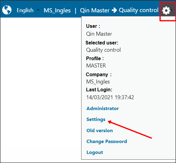
To setup the month display, just click on the gear icon and on the Settings option, as shown below:
On this screen it will be possible to setup the number of months visible on the Dashboard and select the base month of the ICG.
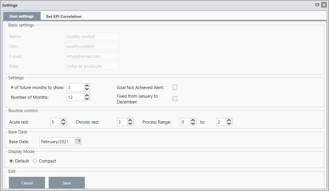
- Number of months: It is the number of months visible on the dashboard.
- Blank Months: Number of months that will be visible after the base month.
- Base Date: It is the month that is being analyzed. By default, the base month is always the previous month in the current month.
In this example, we are viewing nine months, and after the base month (September), there are three months visible.

You can also select the option “Fixed from January to December”.
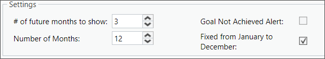
Regardless of the base month, the months from January to December of the year selected on the Base Date will be visible.
Before registering a KPI, we need to understand what each field means.
Type 1C items:
- Green Band: Represents what you are used to achieve.
- Red Band: When reaching the Red Band, it means a problem, it is a result that is far from expected. The reason for this result needs to be analyzed with the Manager.
- Customer Range/Band: It is the goal you want to achieve.
In this type of item, you can register lower and upper values for each of the Bands. When checking the chart, it is easier to understand and visualize the limits of each band.
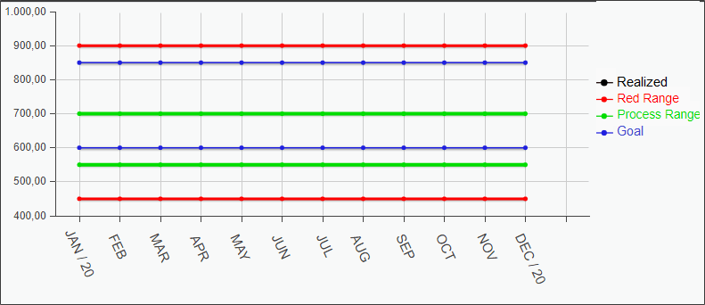
Let’s look at the example above:
The Green Band has values between 550 and 700, that is, the user normally results in values between 550 and 700. If any result is outside this range, an analysis (FCA) must be made to detect the causes for the performed of the month is not within the forecast.
The Lower Red Band has a value of 450, that is, all values that are below this value must be analyzed together with the manager. It needs an immediate analysis.
The same applies to the Upper Red Band, all values above 900 must be analyzed together with the manager.
Between the Green and Red Bands, we have the Yellow Band, an alert band.
In our example, the Lower Yellow Band contains the results between 450 and 550 and the Upper Yellow Band contains the results between 700 and 900.
When the circle/indicator of the month is yellow, the result must also be analyzed, but the manager’s assistance will not be necessary.
The Customer Band/Range is the goal, which we would like to have as a result.
In this example, the KPI is not reaching the goal, since the Lower Green Band is below the Lower Customer Band. It will be necessary to make an Action Plan to improve the results of this item, so that, at the end of the plan, the results are reaching the established goal.
To learn more about colors, visit the article What do the colors of the month mean?
To learn more about Green Band and Customer Band, visit the article Difference between Green Band and Customer Band.
Type 2A, 2B and 2C items:
- Forecast: It represents what you are used to achieve, it is what you are planning to accomplish each month.
- Budgeted: It is the goal you want to achieve, it is what you would like to accomplish.
These item types work with %. When registering the KPI, you will indicate a limit % for each band. To learn more about amplitudes, access the Amplitude Reference article.
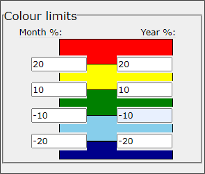
In this case, the limit for the month will be applied to the Forecasted field. If the Expected value for the month is 100, the Green Band will be between 110 and 90 (10% more and less), the Lower Red Band will be 80 (20% less) and the Upper 120 (20% more) .
Between 80 and 90 will be the Lower Yellow Band and between 110 and 120 will be the Upper Yellow Band.
The same is true for the year, however the reference value will be that of the Budget column.
Remembering that the limits for the month and the year do not need to be the same.
[/et_pb_tab][/et_pb_tabs][/et_pb_column][et_pb_column type=”1_5″ _builder_version=”3.25″ custom_padding=”|||” global_colors_info=”{}” custom_padding__hover=”|||”][et_pb_image src=”https://suporte.quattrus.com/wp-content/uploads/2021/03/Artboard-2-copy-5.jpg” title_text=”Artboard 2 copy 5″ align_tablet=”center” align_phone=”” align_last_edited=”on|desktop” disabled_on=”on|on|” admin_label=”ESP – Banner – Contato Suporte” _builder_version=”4.9.2″ z_index=”0″ always_center_on_mobile=”on” saved_tabs=”all” locked=”off” global_colors_info=”{}”][/et_pb_image][/et_pb_column][/et_pb_row][/et_pb_section]