
 Português
 Español
When a KPI has a gray indication in column D, it can be a Totalized or Linked KPI. To find out, click on the KPI and see if it will open the Totalization tab.
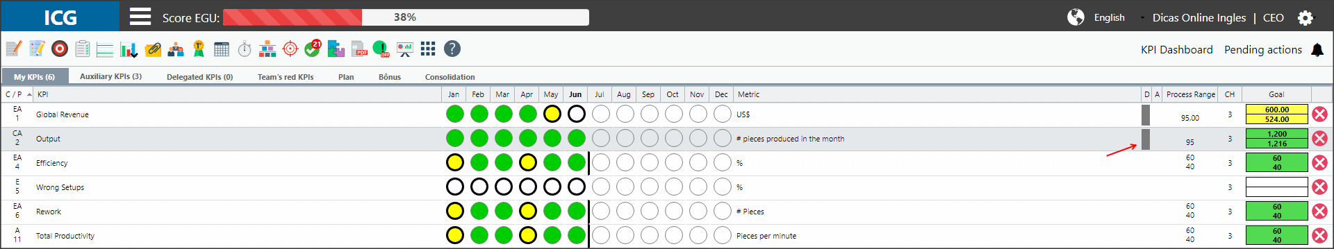
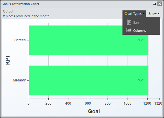
If your KPI is totalized, you can open the Goal Totalization Chart and identify how many and which KPIs are influencing your results.
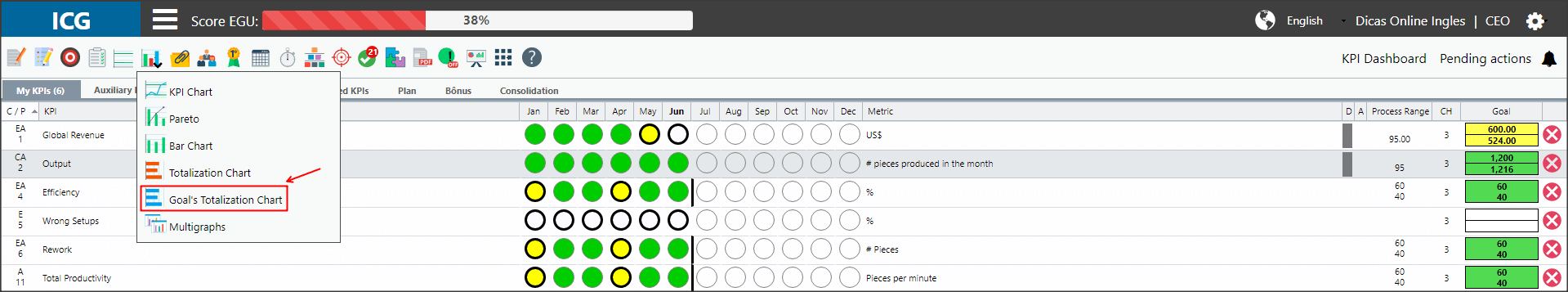
To do this, click on the month you need and then on the charts icon. Select the Goal Totalization Chart option below the Totalization Chart.
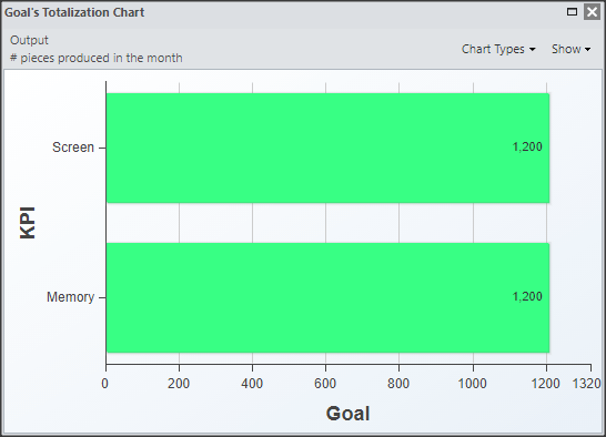
The system will open a chart that has the goal of the month for all KPIs that total your own KPI.
The green values mean that the band reaches the goal, the yellow ones are those that do not reach the goal and have an action plan, while the values in red are those that do not reach the goal and don’t have an action plan.
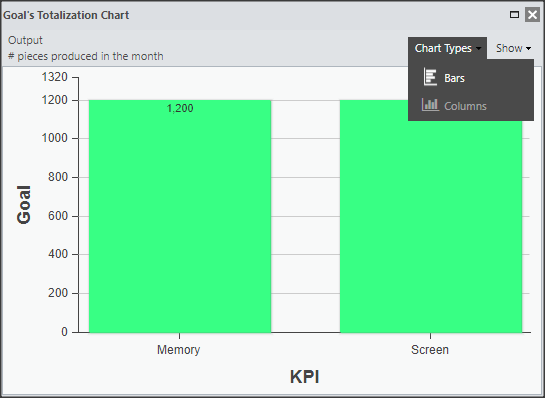
In the upper right corner you have two options for viewing the chart:
You can choose to see the chart in columns or bars. You only need to select the option you want, remembering that the standard display is in bars.
When selecting the columns option, you will see the graph as follows:
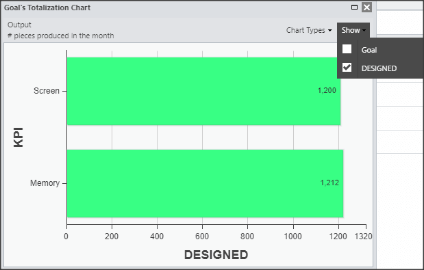
You can see your KPI’s goals and projected. The goal option will appear checked by default:
In the case of Type 2A KPIs, it is possible to choose to see the difference from the Goal by the Designed:
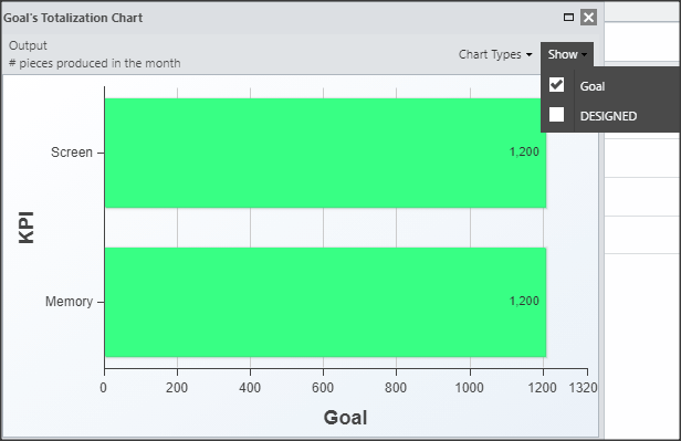
And Designed: