

 Português
 Español
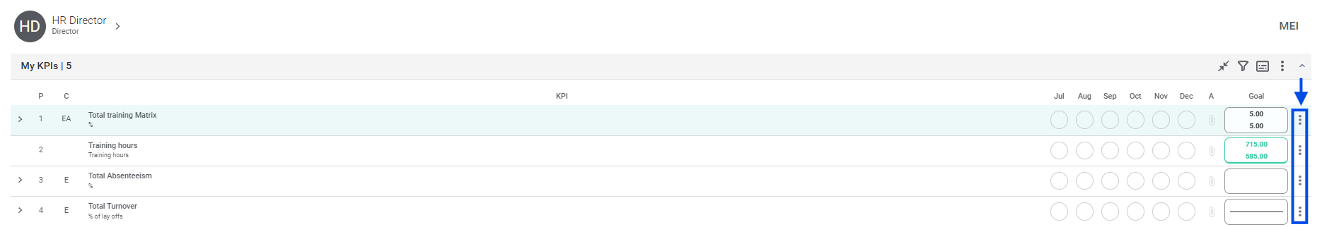
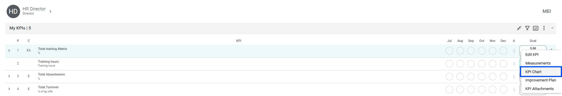
To open an KPI’s chart, go to the desired KPI and click on the three dots icon after the Goal and select the KPI Chart option.
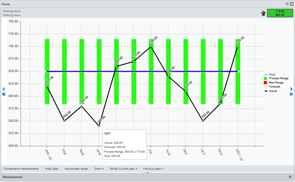
When you open the graph, you will see your measurements.
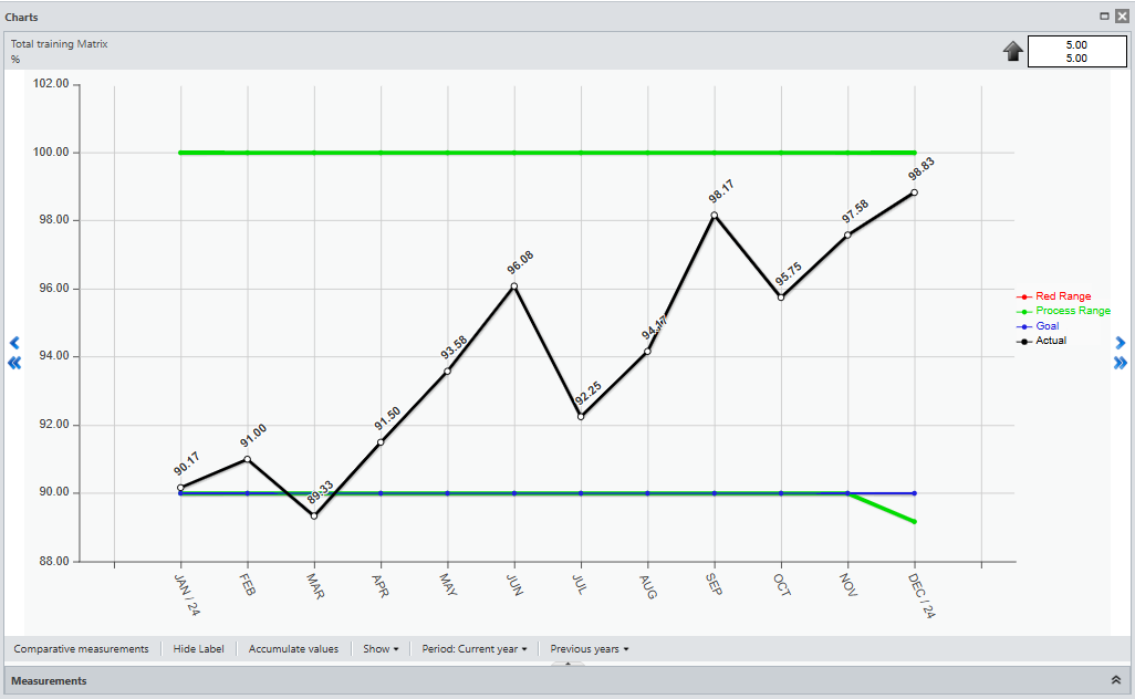
At the top, you’ll see the name and metric of the selected KPI, and you’ll also see whether the KPI is good when more, less or equal.
![]()
You can use the arrows:
![]() – Go Back or Forward a Month
– Go Back or Forward a Month![]() – Go Back or Forward a Year
– Go Back or Forward a Year
At the bottom, you have a few options. See below what each one means:
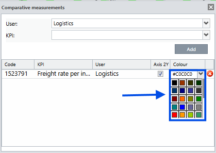
You will be able to compare your items or those of other users, allowing you to make a more complete analysis of your KPI.
When you click on the button, select the user and the KPI you want to compare, then click Add.
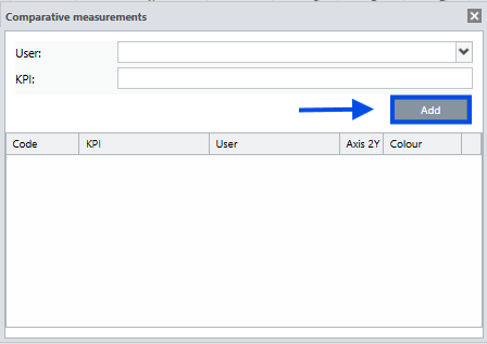
You can select the color you want to see on your graph.
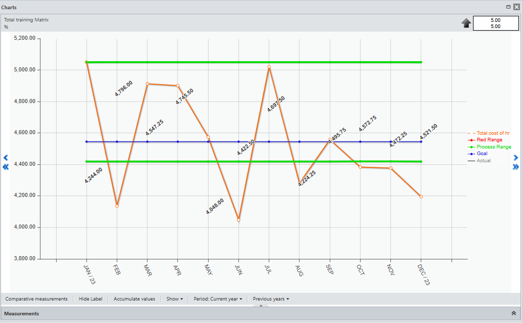
To view the graph, simply close the Comparative Measurements window.
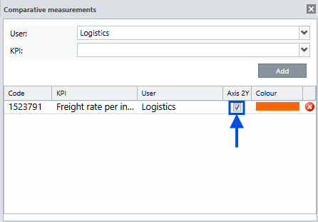
In this case, we don’t have the Y axis enabled.
With the Y Axis not enabled, the system will take an average to give you a better view.
To view the actual measurement, enable the Y-axis.
When you return to the graph, you’ll see the measurements like this:
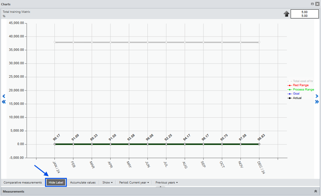
Clicking this button will show or hide your chart’s legend.
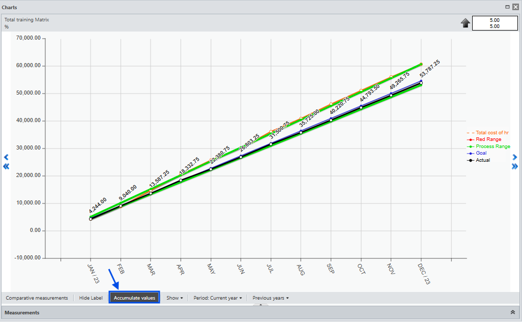
You can view the accumulated values throughout the year. Simply click the Accumulate Values button. Click again to return to the non-accumulated view.
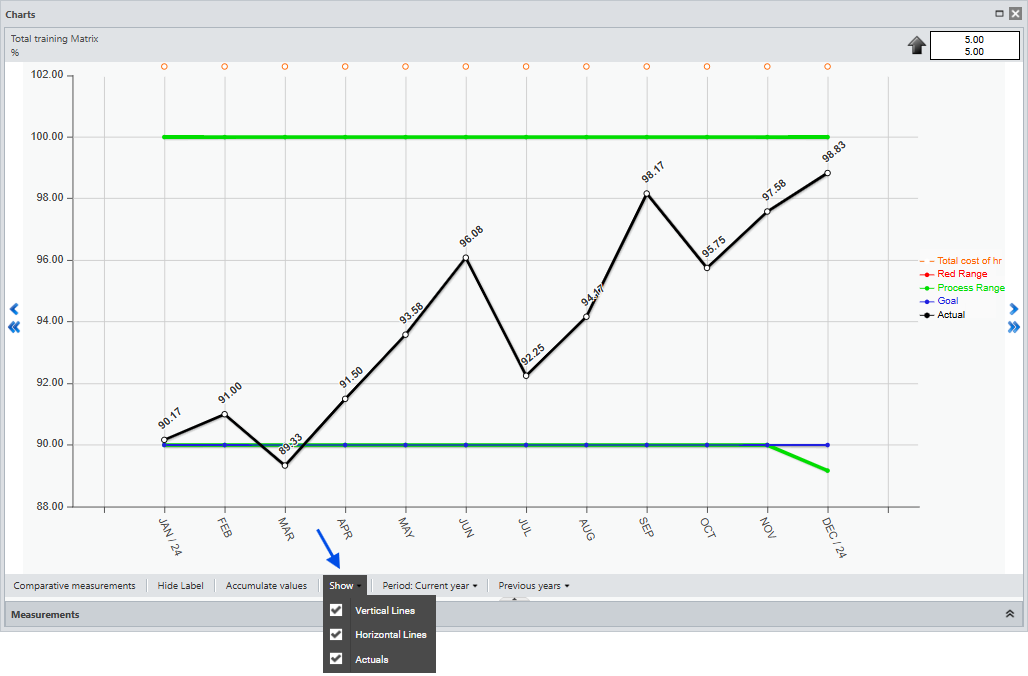
You can configure what the graph displays. You can hide or display the axis lines and the actual measurements.
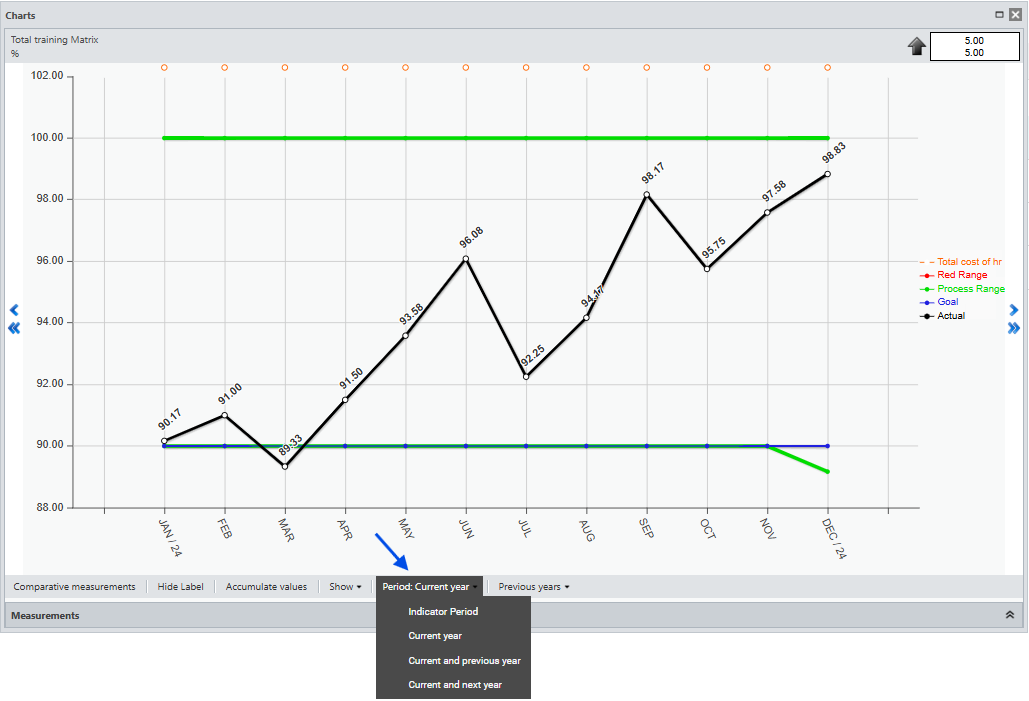
You can choose to view the item period configured in the item registration according to your needs.
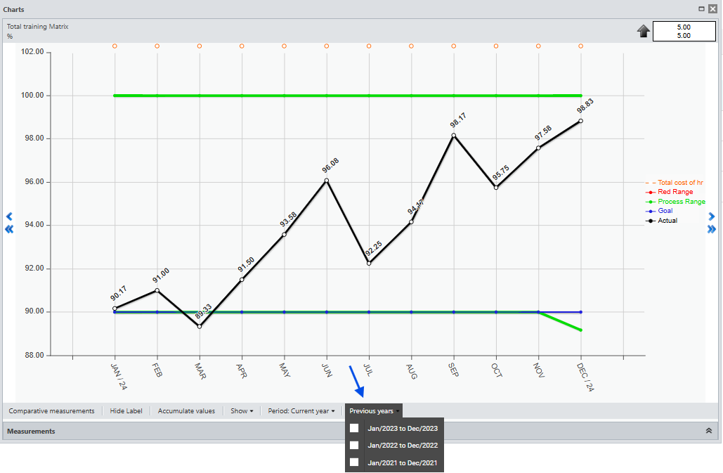
You’ll be able to view your measurements from previous years. Remember, you’ll only see what you’ve actually achieved. In the left corner, you’ll see the minimum, maximum, and average values of your actual results.
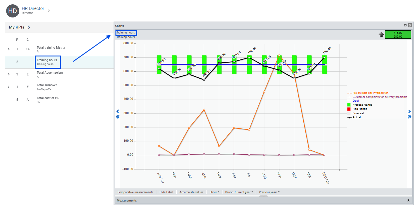
To view the graph of another item, you don’t have to close the graph window, just click on the other KPI.
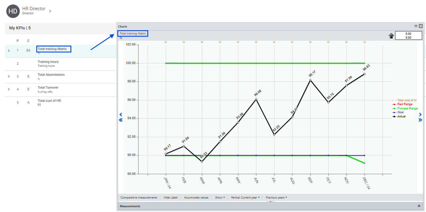
You will then see the graphic for the selected KPI.
Look at the graph; if there is a gray band, it means an Action Plan was recorded during that period.
See more in Action Plan