[et_pb_section fb_built=”1″ _builder_version=”4.4.8″][et_pb_row column_structure=”1_5,3_5,1_5″ module_class=” et_pb_row_fullwidth” _builder_version=”3.25″ width=”89%” width_tablet=”80%” width_phone=”” width_last_edited=”on|desktop” max_width=”89%” max_width_tablet=”80%” max_width_phone=”” max_width_last_edited=”on|desktop” module_alignment=”center” make_fullwidth=”on”][et_pb_column type=”1_5″ _builder_version=”3.25″ custom_padding=”|||” custom_padding__hover=”|||”][et_pb_text disabled_on=”on|on|” admin_label=”Itens Usuário – Navegação vertical” _builder_version=”4.9.2″ max_width=”100%” z_index_tablet=”500″ saved_tabs=”all” locked=”off”]
[/et_pb_text][et_pb_text disabled_on=”on|on|” admin_label=”Artigos Relacionados” _builder_version=”4.9.2″ text_font=”|600|||||||” text_text_color=”#727272″ header_line_height=”1.1em” header_2_font=”|800||||on|||” header_2_text_align=”left” header_2_text_color=”#494949″ header_3_font=”|600|||||||” header_3_text_color=”#494949″ header_3_font_size=”14px” header_3_line_height=”1.2em” module_alignment=”left” z_index_tablet=”500″ text_text_shadow_horizontal_length_tablet=”0px” text_text_shadow_vertical_length_tablet=”0px” text_text_shadow_blur_strength_tablet=”1px” link_text_shadow_horizontal_length_tablet=”0px” link_text_shadow_vertical_length_tablet=”0px” link_text_shadow_blur_strength_tablet=”1px” ul_text_shadow_horizontal_length_tablet=”0px” ul_text_shadow_vertical_length_tablet=”0px” ul_text_shadow_blur_strength_tablet=”1px” ol_text_shadow_horizontal_length_tablet=”0px” ol_text_shadow_vertical_length_tablet=”0px” ol_text_shadow_blur_strength_tablet=”1px” quote_text_shadow_horizontal_length_tablet=”0px” quote_text_shadow_vertical_length_tablet=”0px” quote_text_shadow_blur_strength_tablet=”1px” header_text_shadow_horizontal_length_tablet=”0px” header_text_shadow_vertical_length_tablet=”0px” header_text_shadow_blur_strength_tablet=”1px” header_2_text_shadow_horizontal_length_tablet=”0px” header_2_text_shadow_vertical_length_tablet=”0px” header_2_text_shadow_blur_strength_tablet=”1px” header_3_text_shadow_horizontal_length_tablet=”0px” header_3_text_shadow_vertical_length_tablet=”0px” header_3_text_shadow_blur_strength_tablet=”1px” header_4_text_shadow_horizontal_length_tablet=”0px” header_4_text_shadow_vertical_length_tablet=”0px” header_4_text_shadow_blur_strength_tablet=”1px” header_5_text_shadow_horizontal_length_tablet=”0px” header_5_text_shadow_vertical_length_tablet=”0px” header_5_text_shadow_blur_strength_tablet=”1px” header_6_text_shadow_horizontal_length_tablet=”0px” header_6_text_shadow_vertical_length_tablet=”0px” header_6_text_shadow_blur_strength_tablet=”1px” box_shadow_horizontal_tablet=”0px” box_shadow_vertical_tablet=”0px” box_shadow_blur_tablet=”40px” box_shadow_spread_tablet=”0px” saved_tabs=”all” locked=”off”]
Related Posts
[/et_pb_text][/et_pb_column][et_pb_column type=”3_5″ _builder_version=”3.25″ custom_padding=”|||” custom_padding__hover=”|||”][et_pb_post_title meta=”off” featured_image=”off” _builder_version=”3.19.17″ title_font=”|700||||on|||” title_font_size=”36px” border_width_bottom=”5px” border_color_bottom=”#0c71c3″][/et_pb_post_title][et_pb_text _builder_version=”4.9.7″ custom_margin=”-50px|||||false” custom_padding=”20px|25px||25px||true” hover_enabled=”0″ border_color_top=”#0c71c3″ sticky_enabled=”0″]
When a KPI has a gray indication in column D, it can be a Totalized or Linked KPI. To find out, click on the KPI and see if it will open the Totalization tab.
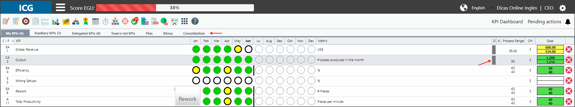
If your KPI is totalized, you can open the Totalization Chart and identify how many KPIs are influencing your results.
To do this, click on the month you need, click on the charts icon and select the Totalization Chart option.
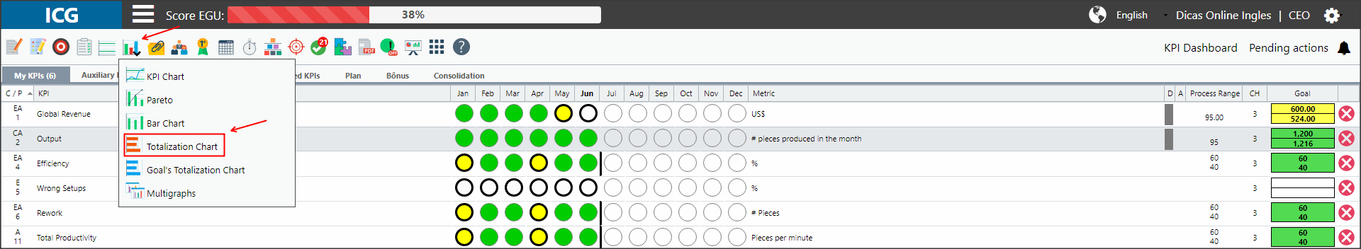
You will then open a chart that contains all the KPIs that total your own KPI.
Green values mean they are within the expected, red values are outside of the expected.
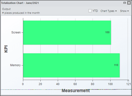
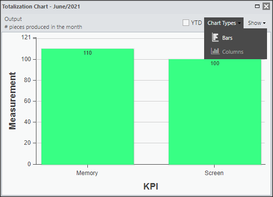
In the upper right corner, you have two options for displaying the chart:
[/et_pb_text][et_pb_toggle title=”Chart Types” _builder_version=”4.9.7″ custom_margin=”-30px|25px||25px||true” custom_margin_tablet=”-20px||” custom_margin_phone=”” custom_margin_last_edited=”on|tablet” hover_enabled=”0″ sticky_enabled=”0″]
You can choose to see the chart in columns or bars.
Just select the option you need.
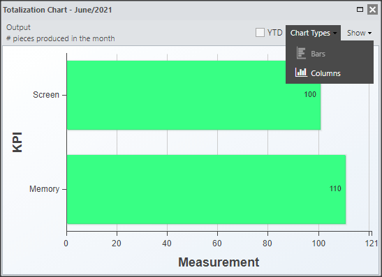
When selecting the column option, you will see the graph as follows:
[/et_pb_toggle][et_pb_toggle title=”Visualization” _builder_version=”4.9.7″ custom_margin=”-44px|25px||25px||true” custom_margin_tablet=”-28px||” custom_margin_phone=”” custom_margin_last_edited=”on|tablet” hover_enabled=”0″ sticky_enabled=”0″]
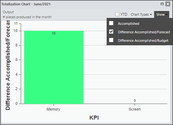
You can see the total accomplished value of each KPI and then you can see the difference between accomplished and planned, accomplished and budget.
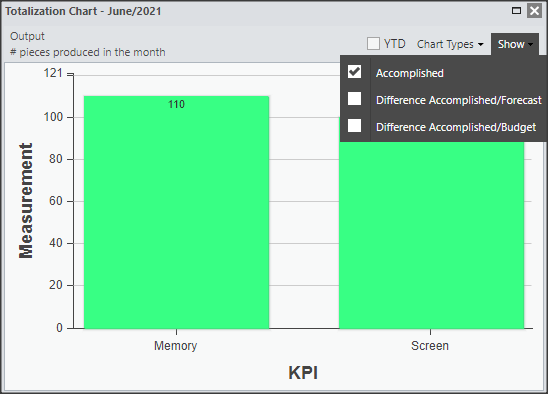
When selecting the “Accomplished/Forecasted Difference” option, the chart will look like this:
When selecting the “Accomplished/Budget Difference” option, the chart will look like this:

[/et_pb_toggle][et_pb_text admin_label=”Borda Inferior” _builder_version=”3.27.4″ custom_margin=”-40px|||||false” custom_padding=”|25px||25px||true” box_shadow_style=”preset3″]
TESTE
[/et_pb_text][/et_pb_column][et_pb_column type=”1_5″ _builder_version=”3.25″ custom_padding=”|||” custom_padding__hover=”|||”][et_pb_image src=”https://suporte.quattrus.com/wp-content/uploads/2021/03/Artboard-2-copy-5.jpg” title_text=”Artboard 2 copy 5″ align_tablet=”center” align_phone=”” align_last_edited=”on|desktop” disabled_on=”on|on|” admin_label=”ESP – Banner – Contato Suporte” _builder_version=”4.9.2″ z_index=”0″ always_center_on_mobile=”on” saved_tabs=”all” locked=”off”][/et_pb_image][et_pb_image src=”https://suporte.quattrus.com/wp-content/uploads/2021/03/Prancheta-1.jpg” title_text=”Prancheta 1″ url=”https://www.qualitin.com.br/consultoria/” url_new_window=”on” align_tablet=”center” align_phone=”” align_last_edited=”on|desktop” disabled_on=”on|on|” admin_label=”Banner – Consultoria” _builder_version=”4.9.2″ max_width=”100%” saved_tabs=”all” locked=”off”][/et_pb_image][/et_pb_column][/et_pb_row][/et_pb_section]


 Português