

 Português
Related Posts
[/et_pb_text][/et_pb_column][et_pb_column type=”3_5″ _builder_version=”3.25″ custom_padding=”|||” global_colors_info=”{}” custom_padding__hover=”|||”][et_pb_post_title meta=”off” featured_image=”off” _builder_version=”3.19.18″ title_font=”|700||||on|||” title_font_size=”36px” border_width_bottom=”5″ border_color_bottom=”#0c71c3″ global_colors_info=”{}”][/et_pb_post_title][et_pb_text admin_label=”Info” _builder_version=”4.9.3″ text_font=”||on||||||” text_font_size=”12px” text_letter_spacing=”1px” text_line_height=”1.5em” custom_margin=”-40px|0px||” custom_margin_tablet=”-20px|0px||” custom_margin_phone=”” custom_margin_last_edited=”on|desktop” custom_padding=”0px|0px||” z_index_tablet=”500″ global_colors_info=”{}”]
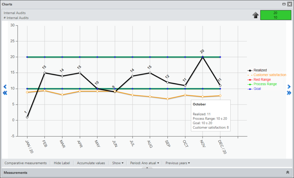
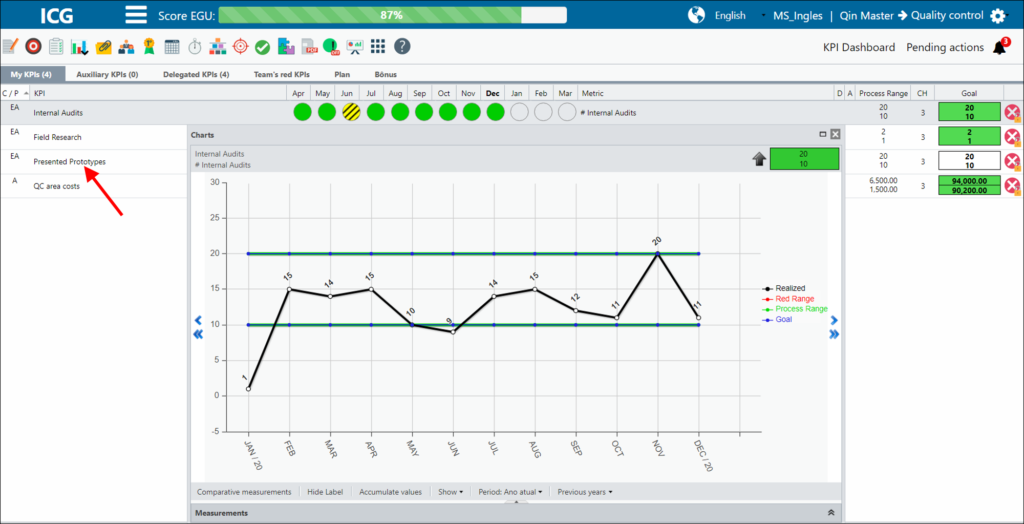
The ICG provides the chart of its KPIs. There you can view and analyze your measurements, understand how your KPI is behaving and make comparisons with other KPIs.
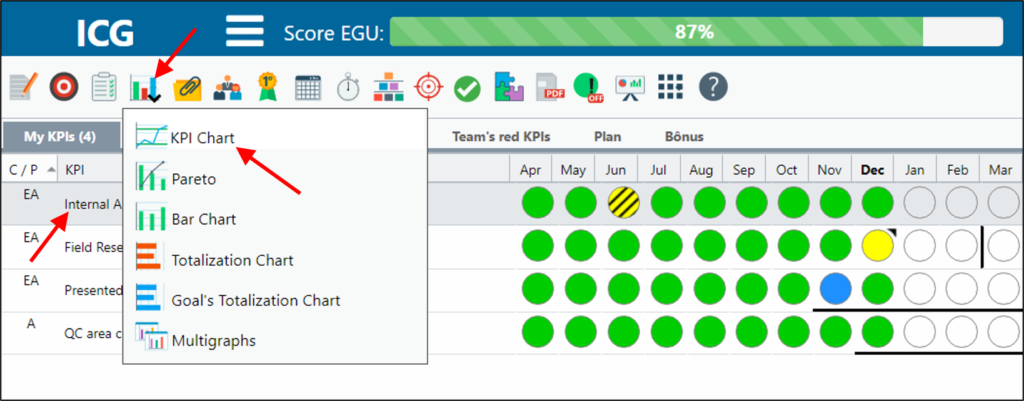
[/et_pb_text][et_pb_text _builder_version=”4.9.7″ custom_margin=”-10px||-20px|” custom_padding=”|25px||25px” border_color_top=”#0c71c3″ global_colors_info=”{}”]To open the chart of a KPI, select the KPI you need and click on the icon below and select the Chart option.
When you open the chart you will see your measurements.
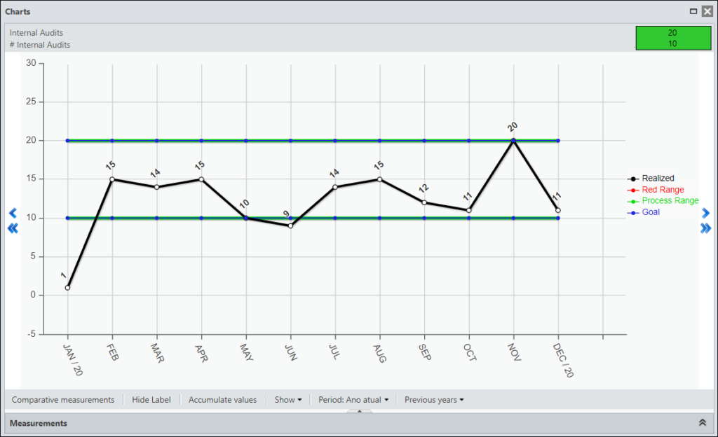
At the top, you will see the name and metric of the selected KPI, and you will also see if the KPI is good for more, less or equal.
![]()
Using the arrows, you can:
![]() – Go Back or Forward a Month
– Go Back or Forward a Month![]() – Rewind or Forward a Year
– Rewind or Forward a Year
At the bottom, you have a few options. See below what each one means:
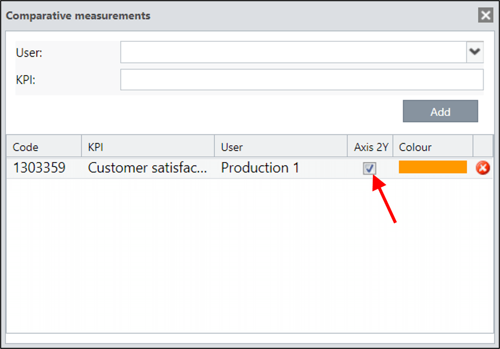
[/et_pb_text][et_pb_toggle title=”Comparative Measurements” _builder_version=”4.9.3″ custom_margin=”40px|25px||25px||true” custom_margin_tablet=”30px||” custom_margin_phone=”” custom_margin_last_edited=”on|phone” global_colors_info=”{}”]You will be able to compare your KPIs or those of other users, being able to make a more complete analysis of your KPI.
When clicking the button, select the user and the KPI you want to compare, after clicking Add.
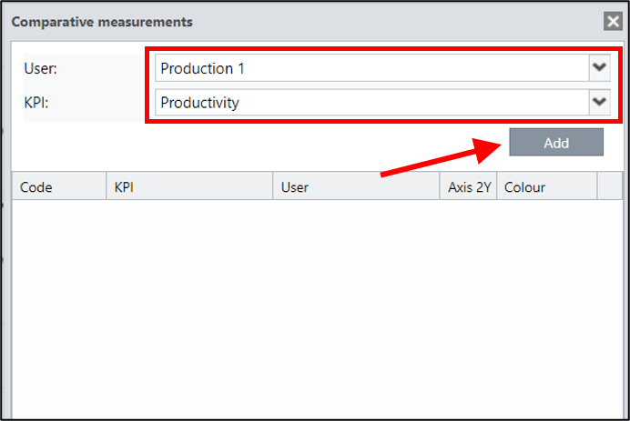
You will be able to select the color you will see in your chart.
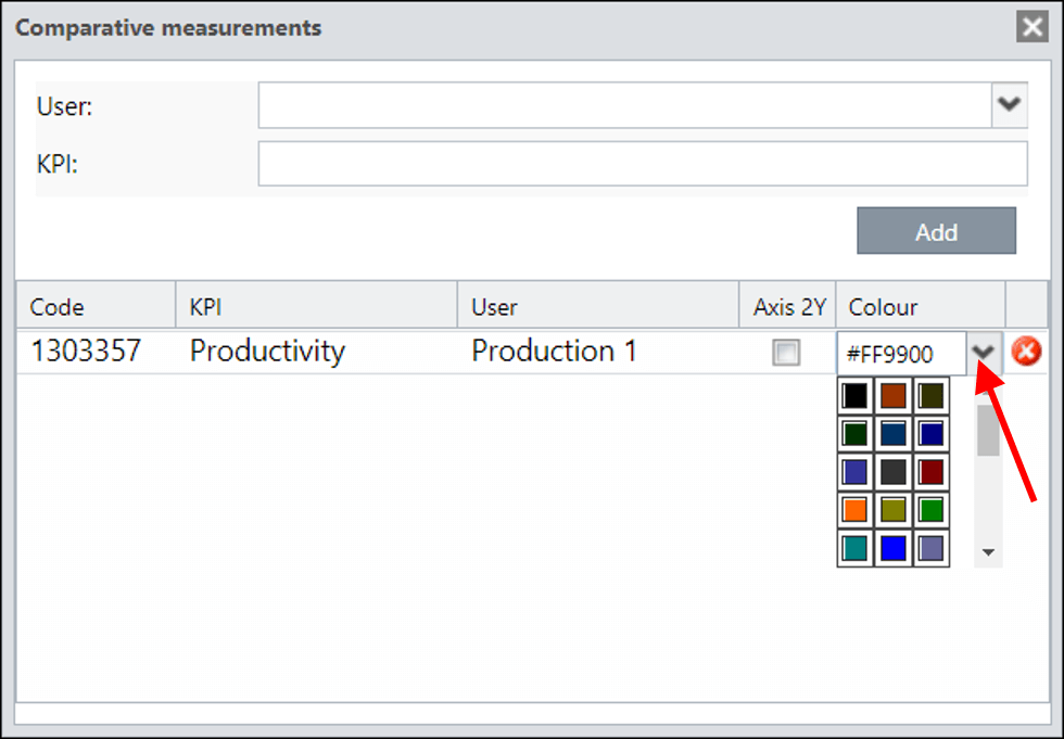
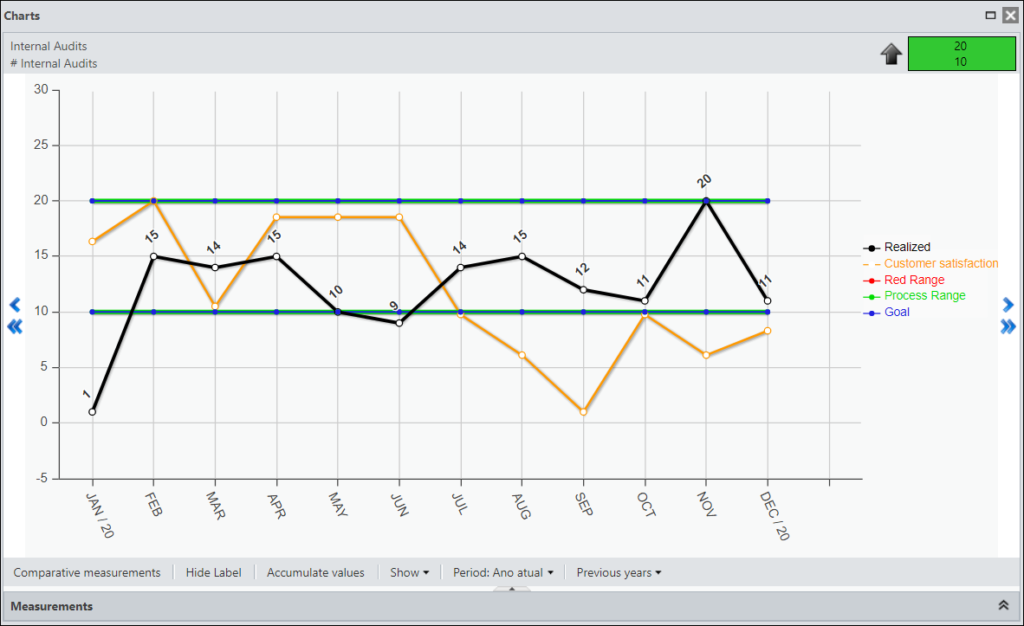
To view the chart, just close the Comparative Measurements window.
In this case, we do not have the Y Axis enabled. Note that the Sector 1 Access measurement was 780.00 and the chart is on the 200.00 axis.
By not enabling the Y Axis, the ICG will average it so that it has a better view.
To view the actual measurement, enable the X Axis.
When you return to the chart , you will see the measurements as follows:
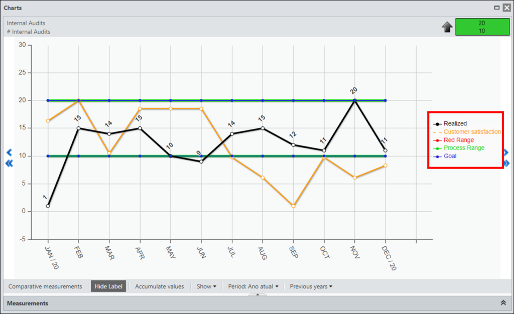
Clicking on this button will show or hide the legend of your chart.
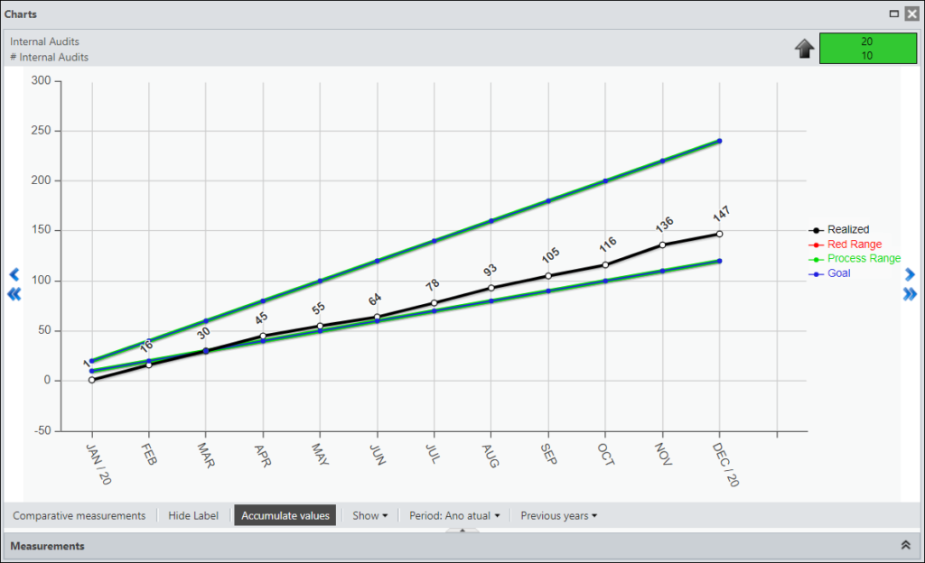
You will be able to view the values accumulated during the year. Just click the Accumulate Values button. Click again to return to the non-cumulative view.
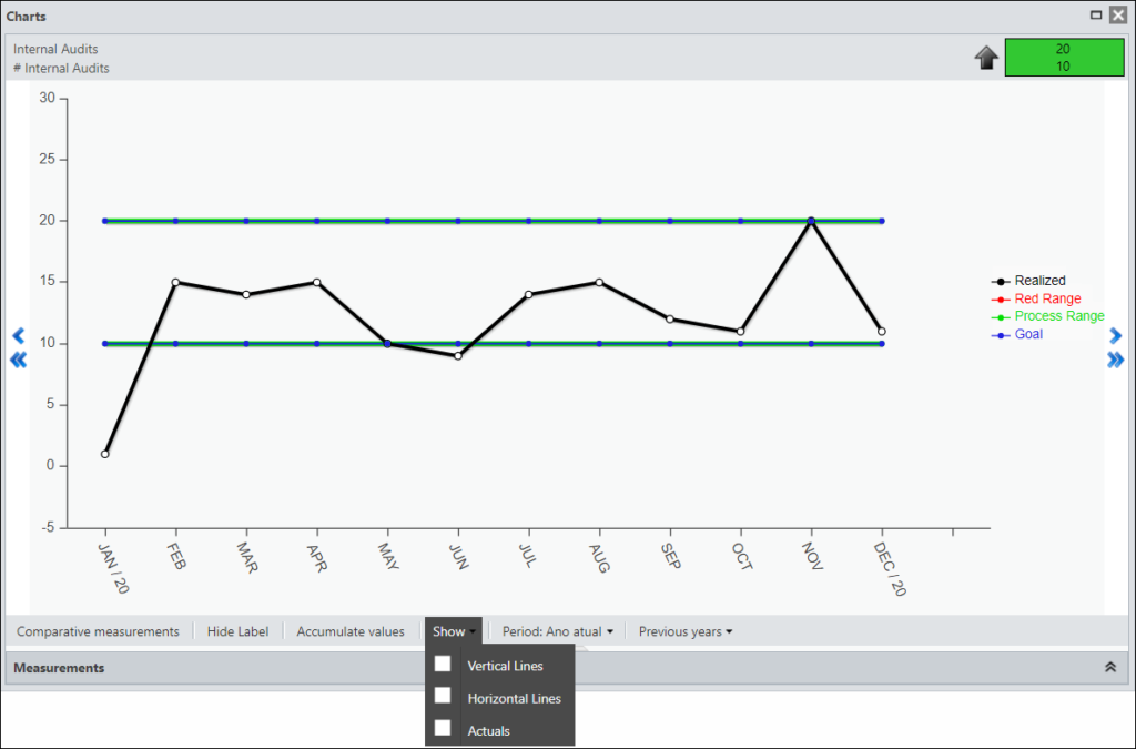
You can configure what the chart will show.
You can hide or show the axis lines and measurements.
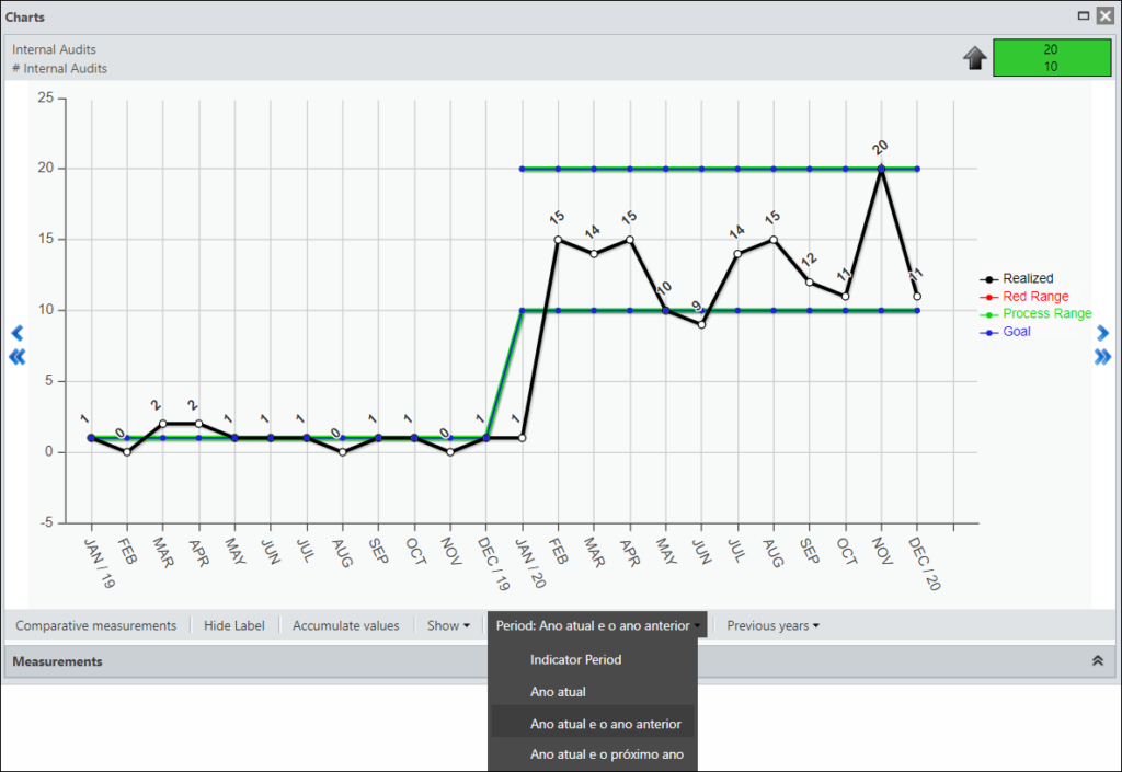
You can choose to view the period of the KPI configured in the KPI Registration, view 12 or 24 months.
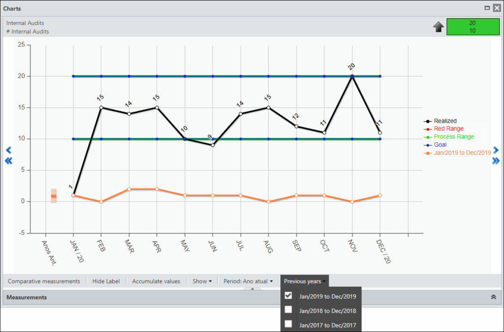
You will be able to view your measurements from previous years.
Remembering that you will see only what has been accomplished. In the left corner you can see the minimum, maximum and the average of your progress.
To view the chart of another KPI, it is not necessary to close the Chart window, just click on another KPI.
You will then see the chart for the selected KPI.
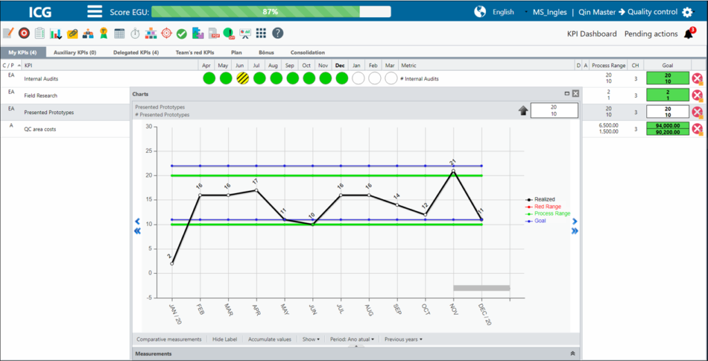
Note that in the months from February to June there is a gray stripe. This means that in this period there is a registered Action Plan.
[/et_pb_text][et_pb_text admin_label=”Borda Inferior” _builder_version=”3.27.4″ custom_margin=”-10px||20px|” custom_margin_tablet=”” custom_margin_phone=”” custom_margin_last_edited=”on|tablet” custom_padding=”|25px||25px” box_shadow_style=”preset3″ global_colors_info=”{}”]TESTE
[/et_pb_text][/et_pb_column][et_pb_column type=”1_5″ _builder_version=”3.25″ custom_padding=”|||” global_colors_info=”{}” custom_padding__hover=”|||”][et_pb_image src=”https://suporte.quattrus.com/wp-content/uploads/2021/03/Artboard-2-copy-5.jpg” title_text=”Artboard 2 copy 5″ align_tablet=”center” align_phone=”” align_last_edited=”on|desktop” disabled_on=”on|on|” admin_label=”ESP – Banner – Contato Suporte” _builder_version=”4.9.2″ z_index=”0″ always_center_on_mobile=”on” saved_tabs=”all” locked=”off” global_colors_info=”{}”][/et_pb_image][et_pb_image src=”https://suporte.quattrus.com/wp-content/uploads/2021/03/Prancheta-1.jpg” title_text=”Prancheta 1″ url=”https://www.qualitin.com.br/consultoria/” url_new_window=”on” align_tablet=”center” align_phone=”” align_last_edited=”on|desktop” disabled_on=”on|on|” admin_label=”Banner – Consultoria” _builder_version=”4.9.2″ max_width=”100%” saved_tabs=”all” locked=”off” global_colors_info=”{}”][/et_pb_image][/et_pb_column][/et_pb_row][/et_pb_section]